📷 ImageNext
Web app for ocular data capture, analysis and visualization. Built for speed, clarity, and clinical confidence, streamlining imaging workflows for global ophthalmology teams.
Intro
ImageNext is Topcon’s next-gen web platform for ocular imaging, built to replace legacy desktop tools with a faster, browser-based experience. Designed for speed, clarity, and diagnostic precision, it supports global clinicians working at the frontlines of vision care.
My Role
I led the UX for the Anterior Segment Scan workflow, collaborating across clinical, product, and engineering teams to redesign one of the most complex and high-stakes areas of ocular diagnosis. I shaped the product from research to rollout, introducing new design system and scaling workflows.
The Problem
The legacy platform was outdated, inconsistent, and globally fragmented. Different regions used different codebases. Interfaces were cluttered, unintuitive, and difficult to scale. Clinicians needed a simpler, faster way to review and act on scan data, especially in high-volume practices where every click counts.
Core issues included:
Redundant and cluttered screen layouts
Inconsistent workflows between US and Global versions
Poor support for anterior-specific scan data
Lack of flexibility across device types and screen sizes
We needed to unify the product, improve speed and clarity, and design for specialists with high clinical expectations.
The Scope
This case study focuses on Anterior Segment Scans, a workflow that helps clinicians assess and monitor conditions like glaucoma and corneal disease.
-
These scans provide imaging and analysis of the cornea and anterior chamber, including a quantitative angle estimation between the iris surface and the posterior corneal surface. This data is critical in assessing risk for conditions like glaucoma and anterior chamber disease—both of which can cause permanent vision loss.
The customer support team had received consistent complaints from anterior segment specialists. Their most pressing concerns:
The existing app was generalist-focused and lacked specialist tools
Key clinical information was hard to find or buried in visual clutter
Navigation was unintuitive, with overly small interactive areas
There was no support for competitive features like thickness maps
The redesign needed to deliver clarity, speed, and diagnostic precision without overwhelming generalist users or disrupting high-volume workflows.
Research Highlights
I collaborated with clinical specialists to understand daily workflows, pain points, and mental models. We:
Conducted contextual inquiry sessions with retina and anterior segment specialists
Observed scan reviews in live clinical environments
Reviewed feedback from internal SMEs and product stakeholders
Audited the legacy app's screens across both US and Global builds
“The B-scan is the first thing I need to see, not buried behind layers.”
Insights:
Anterior workflows were poorly supported, critical data was buried or misaligned with clinical priorities
Most users relied heavily on muscle memory and resisted change unless it clearly reduced cognitive load
There was strong demand for consistency between modules and better visual hierarchy
The problematic original Radial Scan Page that received lots of user complaints.
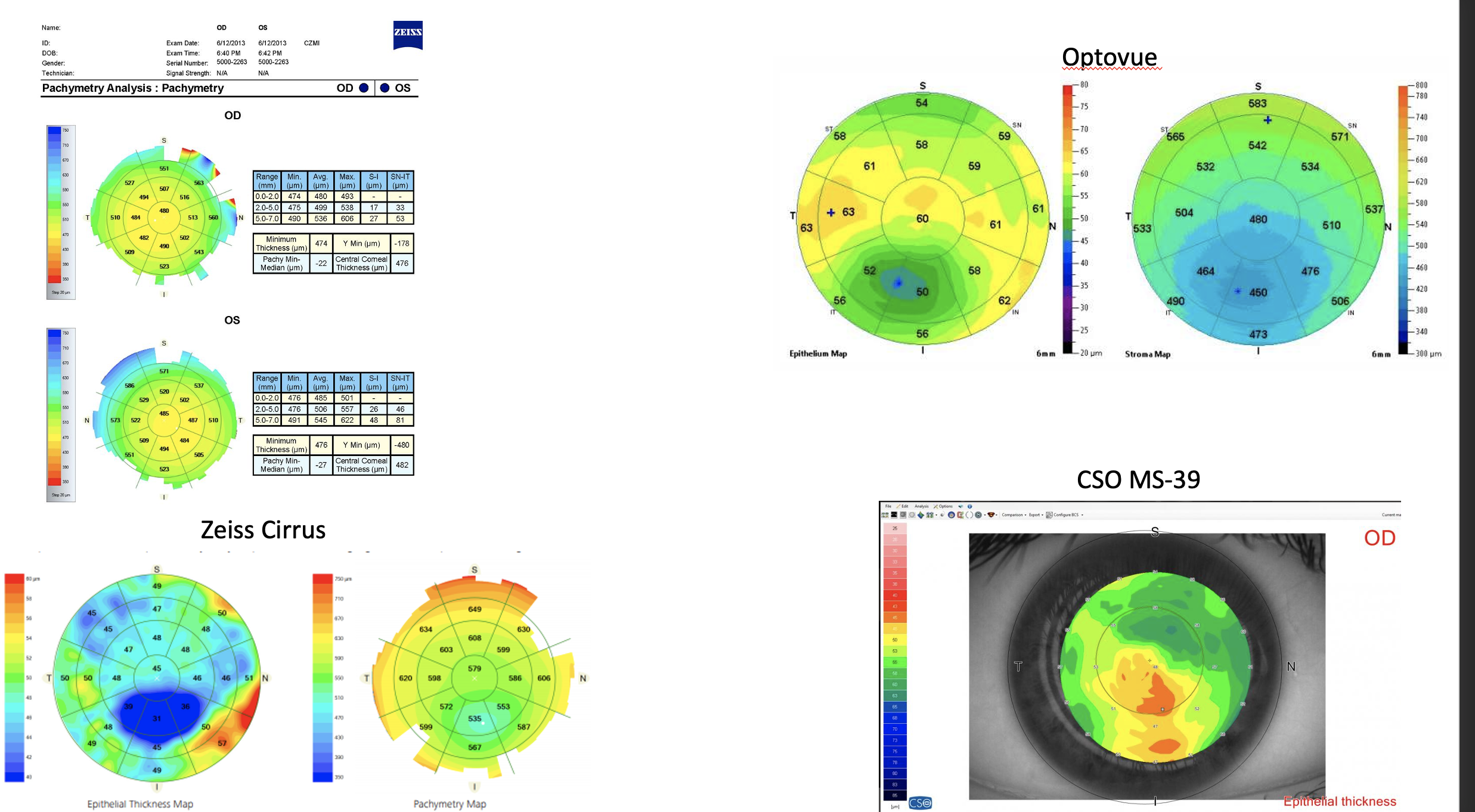
Thickness Map Color Scale Legend - Comparative Analysis
Ideation & Solutions
Based on user research and clinical input, we rethought the Anterior Segment experience from the ground up. The goal: align the product with how specialists actually diagnose and treat.
Key priorities:
Prioritize B-scans and thickness maps, not IR images
Make region selection fast and intuitive
Support both global and US variants without redesign
Add color scale flexibility for different diagnostic models
Bring the UI into Topcon’s modern design ecosystem with Material Design
Layout: Aligned to How Doctors Think
The issue: Legacy software emphasized the IR image, but anterior segment specialists don’t use it. Their focus is on the B-scan and corneal maps, that’s where the diagnosis happens.
The fix: We flipped the hierarchy and this brought the UI in line with real clinical workflows.
B-scan now takes center stage
Map views are larger and cleaner
IR view is minimized or removed
Compare View: Made for Progress Tracking
The issue: The side-by-side compare view was hard to use. B-scans were tiny. The newest exam showed up on the right (opposite of what most doctors expect). Switching scan regions took multiple steps.
The fix:
Newest exam now loads on the left
B-scan views are full-sized
One-click scan region switching
These changes made comparison faster, easier, and more accurate.
Color Scale: One Map, Two Meanings
The issue: Doctors interpret colors differently depending on the scan:
For pachymetry, red = thin = high risk
For epithelium, red = thick = area of interest
There was no standard and no way to adjust.
The fix
We added a toggle to invert color scales
Set safe defaults based on scan type
Made legends and tooltips clearer
This gave users control without compromising accuracy.
Design Process
Before jumping into screens, I defined a scalable, component-based design strategy. Topcon’s legacy UI lacked consistency, so I introduced Google’s Material Design System, new to the company, but well suited for data-dense desktop apps. It came with a mature Figma library (also new to the team) and baked-in accessibility standards.
We mapped out the full application architecture early. Every screen, flow, and edge case was accounted for. A unified navigation model replaced the fragmented structure of the legacy tool, and layout principles were set to optimize clarity, speed, and future scalability.


With that foundation in place, we moved to mid-fidelity layout explorations. Pages like Radial Anterior scans were sketched out to test ideas with engineering (for feasibility) and clinical advisors (for diagnostic value). Feedback loops were tight.


Once we validated core concepts, we built high-fidelity wireframes and interactive prototypes, merging the new scan designs with a modernized application structure. This phase allowed us to refine interaction patterns, component behaviors, and visual hierarchy.
The final designs were approved across clinical, product, and engineering teams, and development moved into full implementation with clear guidance and high confidence.


The final designs were approved across clinical, product, and engineering teams, and development moved into full implementation with clear guidance and high confidence.


Improvements Overview
Over the course of 14 months, we redesigned the entire application from the ground up. Each screen reflects weeks of research, iteration, and validation. Below are examples of final designs across key pages showcasing how user insights shaped the new experience.

Detailed Analysis For Clinical Decisions
Traditionally, clinicians were tied to a single workstation connected to their imaging device. ImageNext breaks that limitation, making advanced ocular data accessible from any Topcon device, in any browser, anywhere.

Multimodal Display
Dynamic viewing of OCT B-scans, 3D images, thickness maps, En Face data, and registered fundus photos (color, red-free, FA, FAF) gives clinicians a deeper, more integrated view of the patient’s condition.

Follow Up Scan For OCTA And 3D Scans
This function automatically retrieves and reanalyzes the same eye location at follow-up. By selecting prior data, clinicians can instantly compare past and current images with no manual alignment needed.
Reflections & Future Opportunities
Next Bets:
Adaptive interface for smaller devices in clinics
Smart scan annotations powered by AI
Personalized dashboard modes based on role (tech vs MD)
One of the biggest wins was designing with scalability at the core. From the start, we optimized for implementation speed by adopting a design system, our shared language between design and engineering. Even custom components followed the same rules, keeping the build efficient and consistent.
Another key success was how we structured and versioned our files in Figma. This enabled multiple designers to work in parallel without stepping on each other’s toes, ensuring clarity, alignment, and consistent output across a complex app.