✉️ Litify Inbox
Outlook App for Legal Case Management
Intro
Inbox is an email extension that helps legal professionals sync their Outlook inbox and calendar with Litify, a legal case management platform built on Salesforce.
Target users included attorneys, legal assistants, and case managers at personal injury law firms, users who depend on efficient workflows and fast access to case-related communication.
The original product faced major issues: confusing UI, overloaded screens, technical bugs, and frequent complaints about support. To address these challenges, our team was tasked with rebuilding the product from the ground up—rethinking its structure, usability, and overall experience.
My Role And My Team
I led user research, synthesized customer support feedback, defined core features, and designed and tested prototypes. I also worked closely with engineers throughout implementation to ensure the final product was intuitive and aligned with user needs.
Key contributions:
Led discovery and user interviews
Created low- and high-fidelity mockups and interactive prototypes
Facilitated design reviews and iteration cycles
Collaborated with engineering on feature development and QA
Contributed to long-term planning for future versions
Team:
Magda Panunzio (Product Manager)
Jake Doetsch (Engineering Manager)
Chase Stephens, Mark Morales, Marcus Hobbs (Engineers)
James Daniels (QA Engineer)
Together, we launched Version 1 of the redesigned Inbox and laid the foundation for future improvements.
Process
I followed a user-centered design approach to understand how legal professionals organize their workflow within Litify. This included user interviews, input from customer success and executive teams, and a competitive analysis of similar tools in the legal tech space.
Using insights from research, my team and I explored multiple design directions. We tested early concepts, gathered feedback, and refined the most successful ideas into a final design ready for development.
Throughout the build phase, we continued testing and iterating, checking in with users regularly to make sure we stayed aligned with their needs and adjusted as new information emerged.
Research and Data Synthesis
To ground our design decisions in real-world context, I led exploratory research that included stakeholder interviews, user observations, and a competitive analysis of similar tools in the Outlook add-in space.
Competitive Analysis
To better understand the landscape, I analyzed six competing Outlook add-ins. I focused on UI patterns, core functionality, and how each platform handled email triage, attachment workflows, and file management. This helped us identify common pain points and missed opportunities and ensured we weren’t reinventing what already worked well.
The goal of the analysis was to identify the most effective and widely adopted features across platforms and evaluate which ones could translate well to the Litify Inbox experience. I focused on questions like:
How do these tools function at a system level?
What features do users rely on most?
What UI patterns and layouts support smooth, efficient workflows?
This analysis gave me a clearer sense of industry standards and helped shape the feature set and structure of our own solution.
Key Findings
90% allow users to rename subject lines and documents
100% support saving attachments to designated folders or document management systems
4 out of 6 offer customizable fields and user-level search settings
90% include UI elements outside of the sidebar for better usability
90% make it easy to attach documents to outgoing emails
4 out of 6 offer advanced filters (e.g. recent files only)
Notable Standouts:
EBSTA is the only app that supports bulk email saving to a case or matter
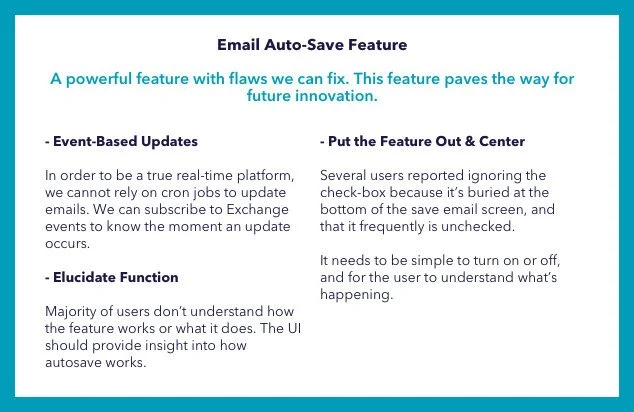
CIRRUS is the only one with fully functioning auto-save for emails and attachments
These insights helped shape our feature priorities and UI decisions, ensuring the new Litify Inbox aligned with user expectations while addressing gaps in the market.
User and Stakeholders Interviews
Stakeholder Interviews (7 participants)
The goal was to gather strategic insight and validate early assumptions. I focused on:
Understanding the context in which users perform daily tasks
Uncovering hidden problems or workflow inefficiencies
Prioritizing the most pressing issues across roles
Gathering input on potential improvements and feature direction
Inbox User Interviews (9 participants)
These conversations helped us understand the user experience in practice. I focused on:
The types of issues frequently escalated to CS
Technical limitations users encountered with the current version
Short- and long-term expectations from executives and decision-makers
How the app helped or hindered the sales process
Feature expectations from high-priority clients
Affinity Maps
I organized all interview data into three categories: Feedback, Behavior, and Features. From there, I identified patterns and grouped insights into key product areas.
I began the process with physical sticky notes, then moved everything into Miro to collaborate with remote teammates. Together, we reviewed each group, discussed emerging themes, and translated them into actionable design requirements to guide the next phase of the project.


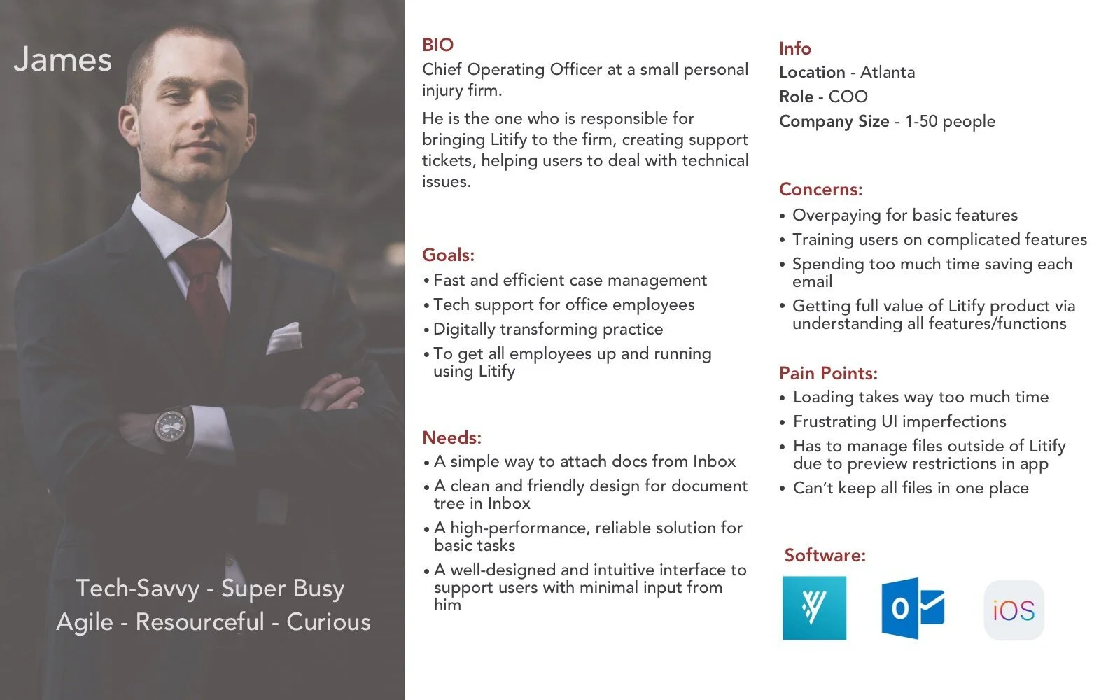
User Personas
Using insights from user and stakeholder interviews, I developed two personas to represent our primary user groups.
The Case Manager who works at a large law firm with a structured workflow, focused on volume, speed, and consistency
The Tech-Savvy Executive who runs a small personal injury firm, wears many hats, and values flexibility and control
These personas reflected the contrast in needs across firm size and role and helped ensure the final design worked for both specialized and generalist users.

Research Conclusions
Designing for a diverse group of users from tech-savvy executives to task-focused case managers highlighted the need for a flexible and scalable system. The solution had to support both straightforward, guided workflows and more complex configurations depending on firm size and role.
To achieve that, we focused on:
Building a robust configuration layer with customizable fields and object types
Enabling flexible permission settings to adapt to different organizational structures
Writing clear, actionable error messages to reduce friction and support troubleshooting
Feature Assessment and Direction of Design
Based on the user’s feedback and the takeaways from the conversation with the customer success team, I defined 6 main areas for improvement.
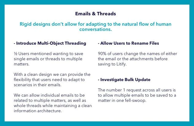
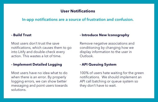
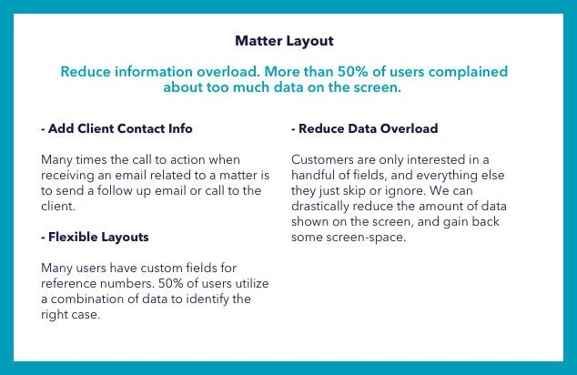
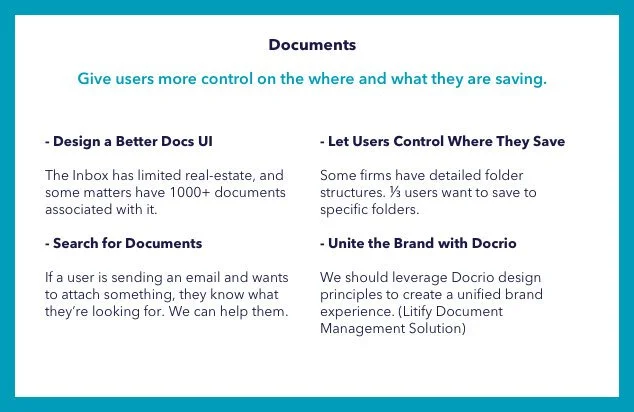
Two of the most challenging ones were the document module and multi-object threading. For those, we had some ideas that needed user validation.


Technical Research
During the research process, we also identified some technical unknowns which had to be explored. We needed to learn about using the Salesforce Lightning Design System and Outlook Design Guide, ability to inject Litify content & iconography directly into the Outlook app or browser, and the concept of related objects in Salesforce.
The outcome of this user research and technical exploration determined the finalized feature set. After days of collaborative work with engineers, my team and I came up with the V.1 Final list of Features, Design Requirements and the decision to use the Salesforce Lightning Design System (SLDS).


Design, Testing, and Development
Phase One
I love collaborating with my teammates and explore different perspectives from designers, engineers, and managers. To get different ideas from my coworkers I organized a design studio exercise. Given one use case as an example, each of the participants sketched their vision on how the app's UI could look like. We reviewed every drawing, gave each other feedback, asked questions, and voted on the best solutions. Many of these ideas were later used by me in prototypes.
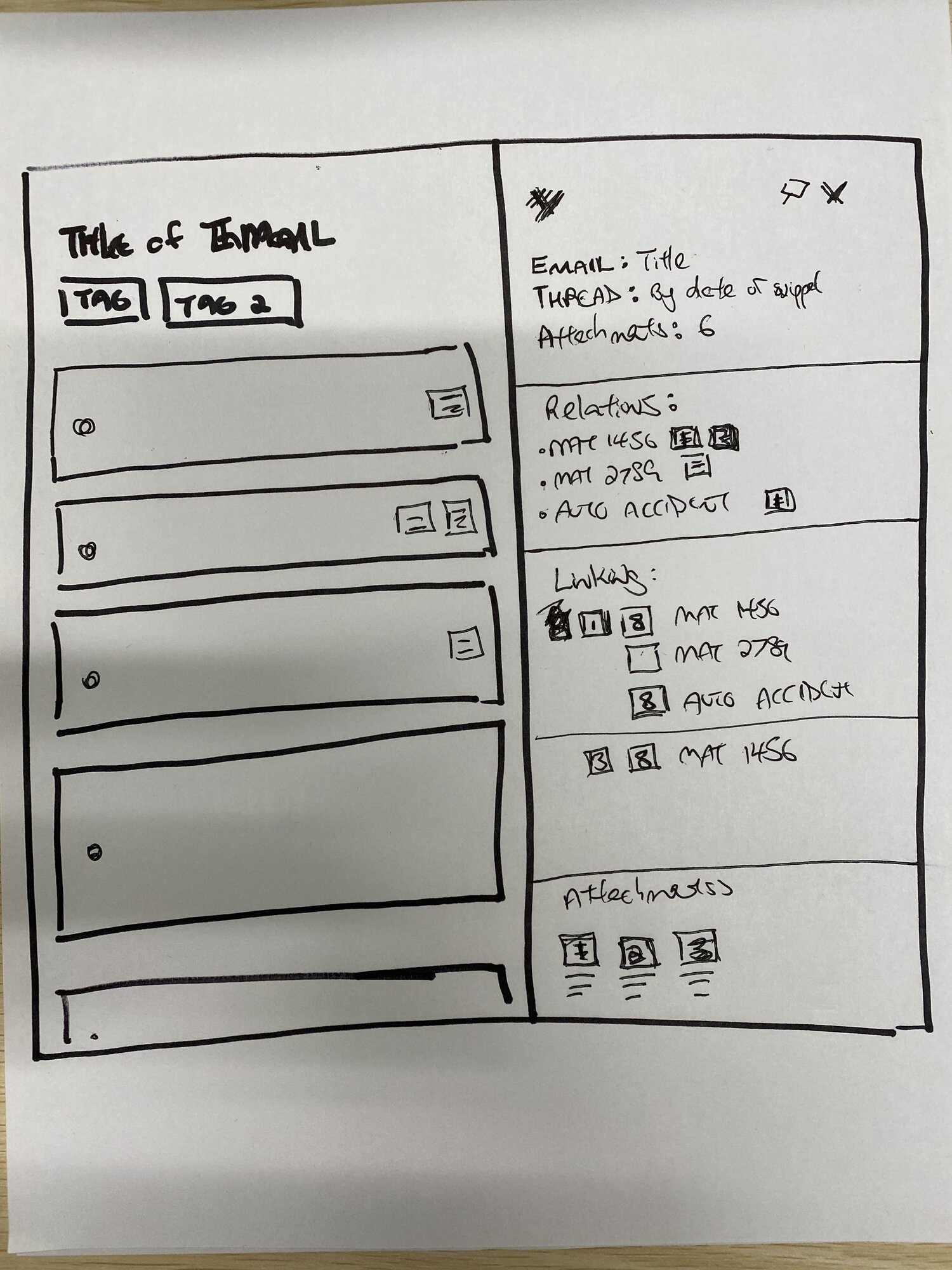

The first prototype included a view of available files for saving, nested structure of matters and related files, simple typeahead search with two types of objects.


I tested these mockups with several case managers and validated the need for rethinking the concept. The most important areas for improvement were:
the save flow wasn't straightforward for a user due to many available actions on the screen at the same time
users couldn't distinguish saved threads from emails
users weren't confident navigating through the nested documents and didn't understand where the files are saved
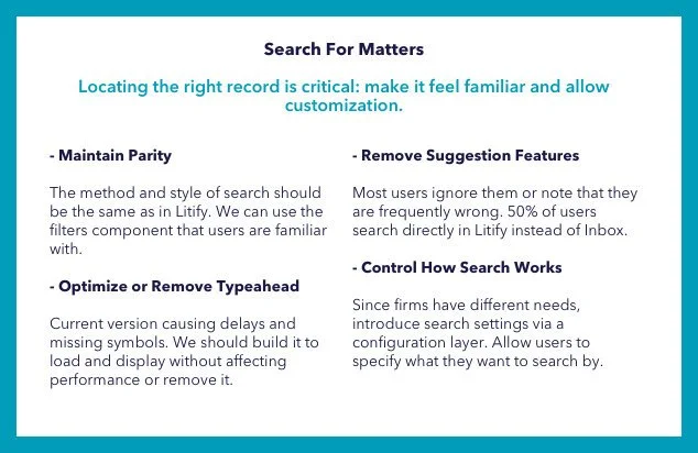
needed filters for the search to narrow down results
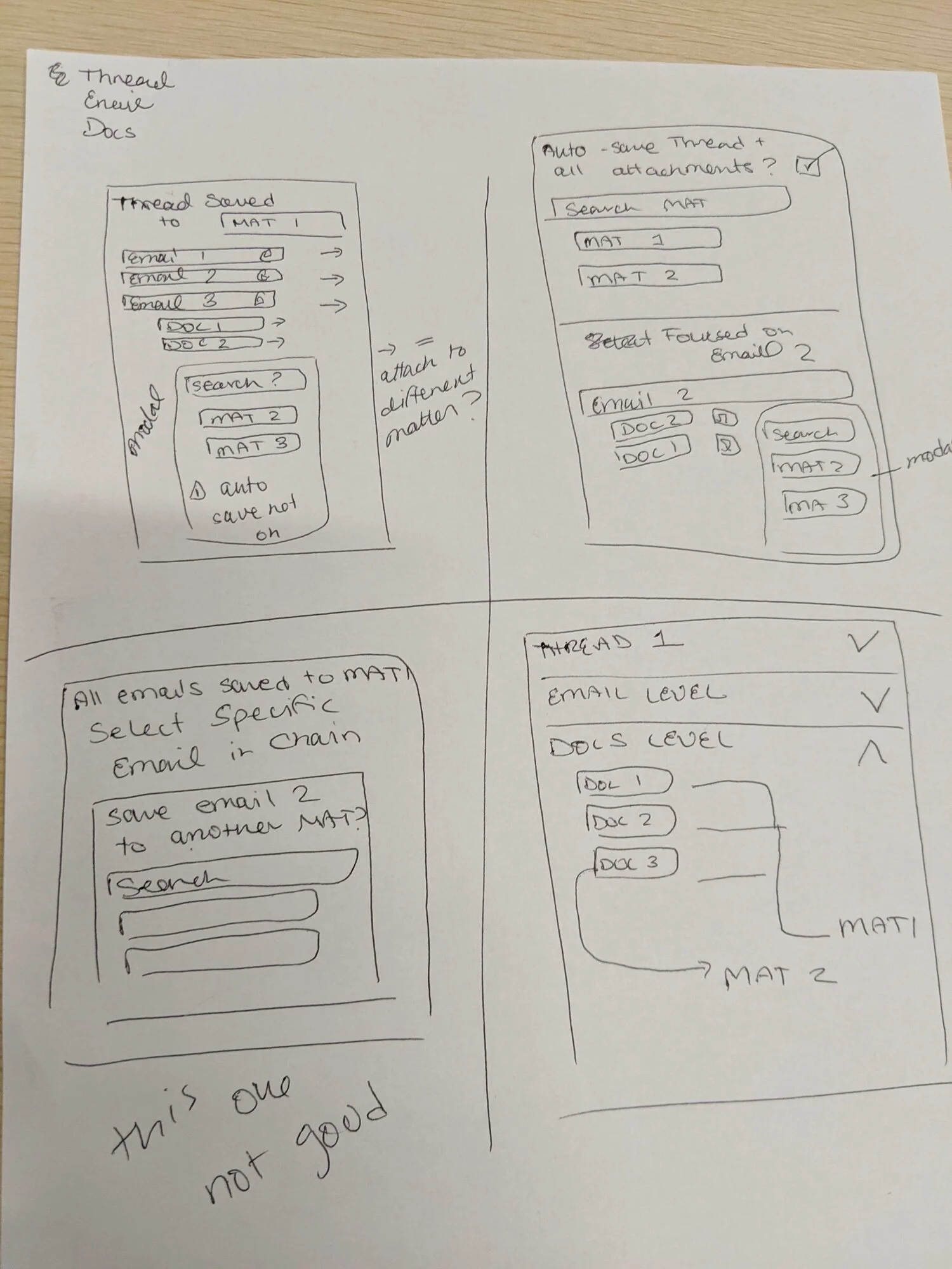
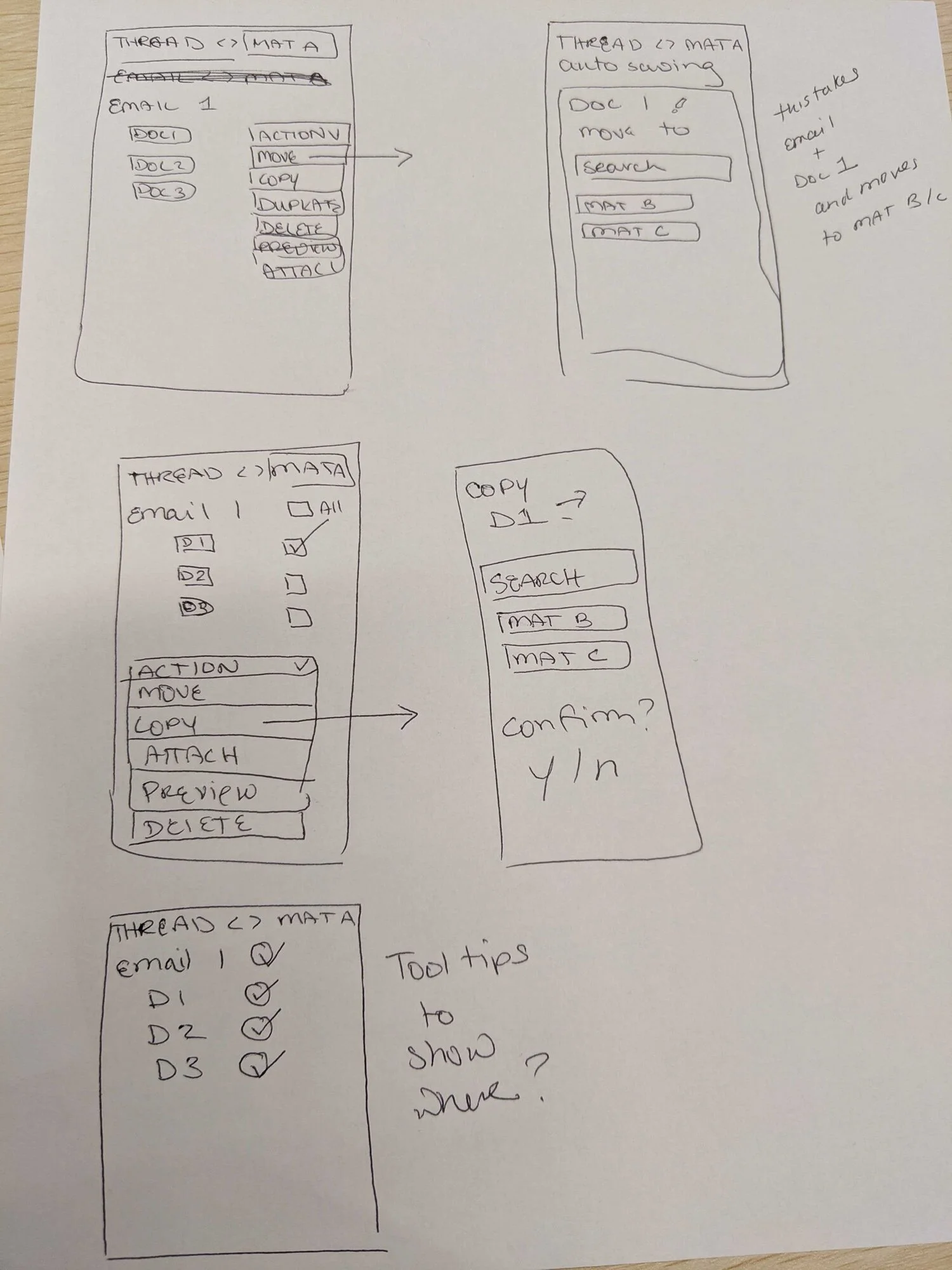
Phase Two
Based on the findings and the feedback I decided to take a step back and to do another whiteboarding session. The main challenge was figuring out how to represent the saved status of the object based on given conditions. The visual architecture had to respond to several conditions:


After defining the logical flow I created an extended user flow that would articulate all possible scenarios to engineers and be a guide for the backend architecture planning.
The second prototype included the new concept of displaying saved matters in the shape of floating cards and the classic folder-view document module. This version gave the app a fresh clean look and provided insights on the matter status at glance. I incorporated search filters by type of an object and last activity because these two criteria were requested by the majority of users. Another change was guiding our user through the entire process of saving a matter by hiding or displaying certain modules step by step based on the conditions.


Testing at this stage was a big success. I reached out to 7 users from different law firms and asked them to perform a few tasks using the prototype. The feedback was very positive, testers were excited about the new concept and layout, simple design, and guiding interface. Testing validated the working concept of floating cards. A few elements still needed a change. We learned that:
The available files module at the top of the screen is confusing and blocking search. We decided to remove it and locate the search module as the first element of the screen.
Document module needed visual clues for different file types and the opportunity to preview a file before attaching it to an email to avoid mistakes.
We needed to give our users a way to recover from an error by removing email or thread from an object in Salesforce.
We needed to let users change what and where they save files at any point in their journey. The decision to incorporate flexible toggles available after clicking the matter cards.
Phase Three
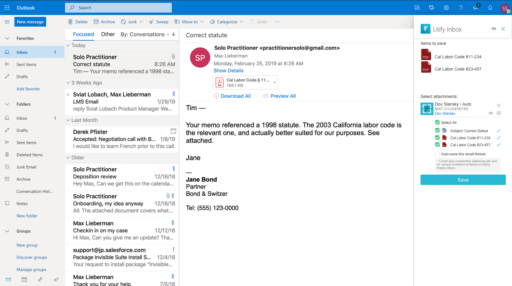
The final design included all the feedback we could technically implement into the v.1. The rest was captured in a list of potential features for v.2. I also updated all the elements in the prototype using The Salesforce Lightning Design System. This helped to achieve the goal of dynamic styling for different clients and parity with the main Litify product that is built on Salesforce. After the final round of testing and validating the working concept, we moved to the development phase! Litify Inbox was included in the Litify solution package as well as considered to travel as a standalone email management tool.


Reflection
Design System Advantage.
My collaboration with engineers is one of the essential aspects for shipping a product. Using the well-crafted design system helped me to handle accessibility, smooth and fast developer hand-off, visual consistency, dynamic styling, and parity with the main Salesforce product. Offering our users familiar feel and look led us to success, making the interface intuitive and easy to navigate through.
Less is more.
The biggest problem of the first product was informational overload. Although each feature of it was brilliant on its own, mixing them all together on a tiny screen made the experience overwhelming and impossible to test the power of the app. Using research to learn what the most important tools are and focusing on building it helped us to satisfy our users and solve their problems.
Flexible and scalable product.
We learned that each personal injury law firm is different and has its own workflow. This discovery helped us to form an idea of a scalable and flexible product that gives Litify the opportunity to expand the market far beyond just one industry.