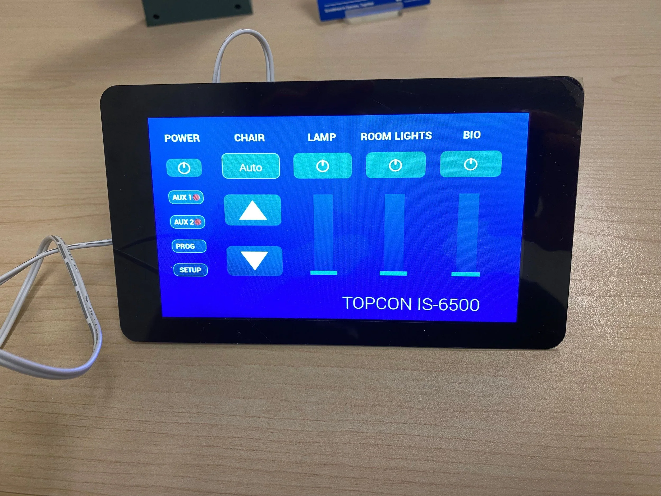
⚡ IS-6500 Control Panel
Touchscreen for controlling ophthalmic exam room lighting, instruments, and chair positioning.
Overview
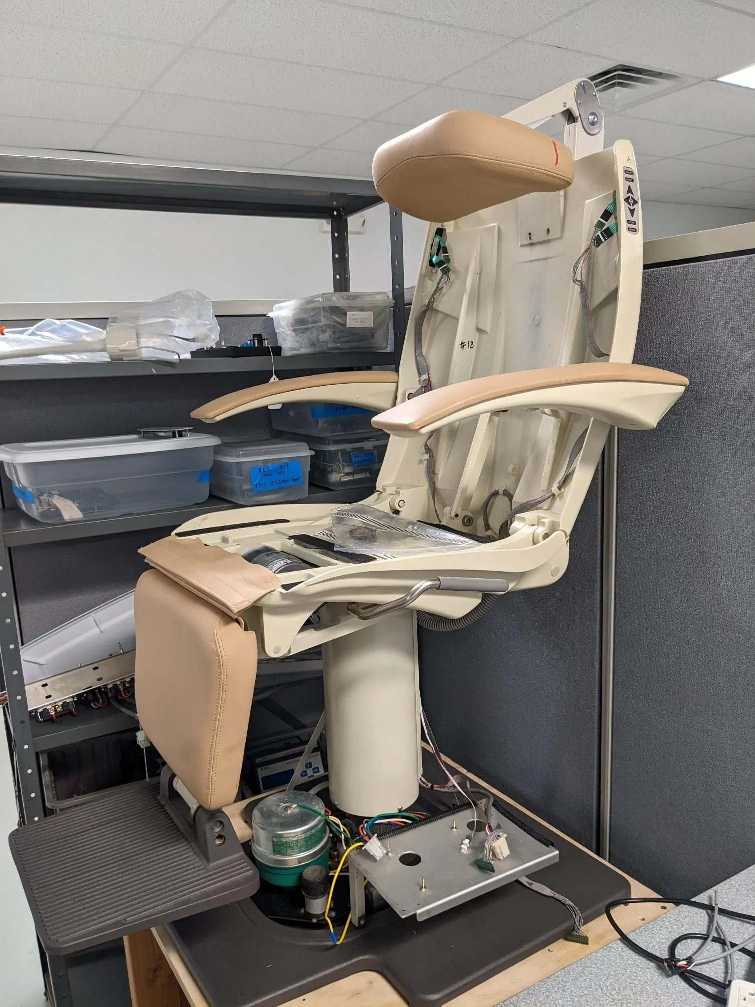
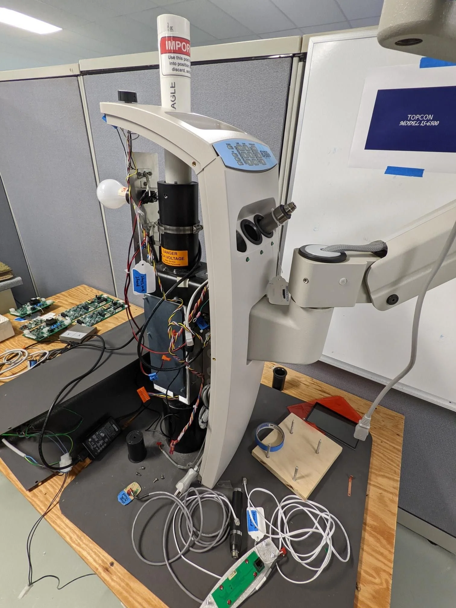
The Topcon IS-6500 is an ophthalmic instrument stand and chair. The patient sits in the chair while the doctor examines them. The system includes three charging wells for handheld tools, refractor and slit lamp arms, a BIO hanger, and an LED overhead lamp. At its core is the control panel, giving doctors quick, intuitive control over their exam room: dim lights, power auxiliary tools and adjust the patient chair, all without breaking the flow of the consultation.


The IS-6500 launched in 2024 across the US, Canada, and Latin America. It’s Topcon’s next-generation ophthalmic instrument stand and chair, where patient comfort meets clinical efficiency.
The biggest difference between this model and its predecessor is the digital touch screen instead of the physical button based control panel. User's can use this control panel to easily operate the stand and chair even in dark environments.
Tools: Legato Graphics Composer, Figma.
Team:
Me - UX Design Lead (design strategy, planning, research and design)
Sam Mroz - UX Designer (prototyping, testing)
Jason Kercher - Developer (mechanical and software engineering)
Richard Almiron - Product Manager (market research, product launch)
The Challenge
Translate the physical workflows into a digital medium while maintaining all functionality of the original control panel.
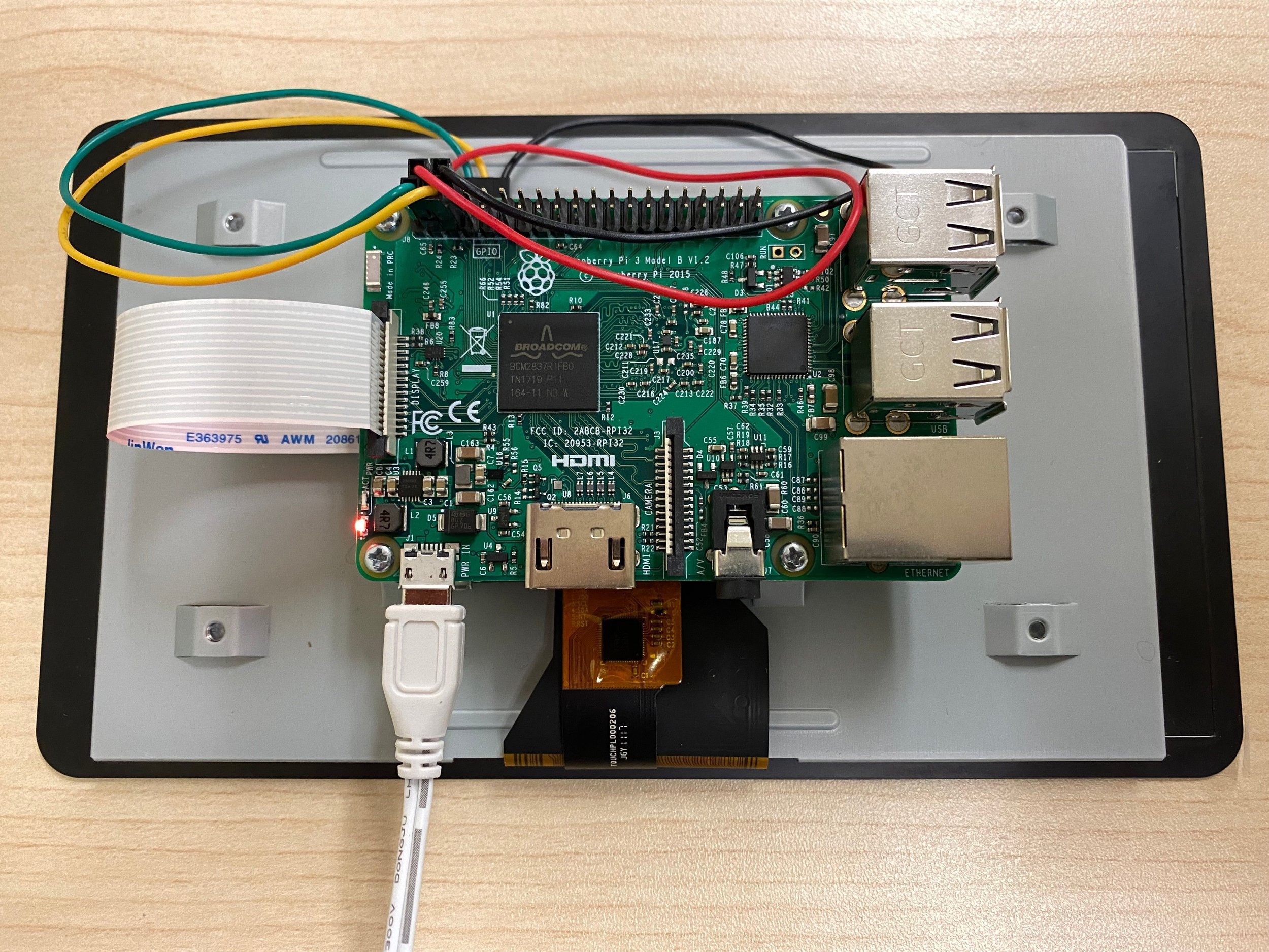
The LED display is a limited 800px by 480px touchscreen.
Programming is limited to the "Legato App" graphic composer. The Legato app is very limited in what controls and customizations are available for the touchscreen. For example, there are no slider or toggle components.
Research
Instrument stands are an essential component of any eye-care facility. While they are used by all eyecare professionals, we focused on optometrists for our research. Approximately 90% of instrument stands sold in the US are sold to optometric offices so we felt this adequately covered our bases.
Market Research
This step was conducted by the product manager as a part of the preliminary research to compare the best features of other stands and get a deeper understanding of the current market trends.
Another point of reference was Topcon’s IS-5500 instrument stand launched in 2016. The star feature of this stand was “Program Mode” which offered doctors the ability to program their room environment for each device they use. For example, when they turn on the Slit Lamp, the room lights automatically turn off and the overhead lamp turns off. When they finish using it, the lights return to their original mode. However, the control panel used to configure this was mechanical and required a user manual to set up any of the features.
IS-5500 Instrument Stand
Original IS-5500 control panel.
User Interviews
We talked to company stakeholders, the sales team, and optometrists to better understand what works well and what doesn’t. Then we used affinity maps to organize and analyze the data gathered from the user interviews.
What we learned:
Some doctors use all 3 charger cups interchangeably and do not have specific spots for certain devices.
Most users were unaware of the star “Program Mode” feature
altogether.The majority of doctors were hesitant to interact with the stand controls in fear of disturbing their workflows.
All doctors have unique room environments for each device that they use. Meaning one doctor might prefer to turn off all lights when using a handheld device while another may prefer to just dim them when using the same tool.
Conclusions:
The user interview insights validated our assumption that the current mechanical control panel is too complicated and not user friendly.
We also learned that most doctors have their own unique way to set up the room environments so we should offer per-doctor workstation customizations.
Ideation
“How might we help eye-care professionals perform patient exams efficiently by providing a convenient instrument stand to easily control their exam room environment from one screen”
As we were beginning the ideation phase, the engineers started building the first prototype of the new IS-6500 instrument stand and the patient chair connected to it. They also transferred the mechanical panel’s functionality onto a prototype LED screen.
Information Architecture
While all the functionality was on the first prototype of the LED screen, the layout from the original stand wasn’t adapted for a touch-screen. To start thinking about a multipage experience I created the site map to organize and plan all possible pages, functionality and overall structure of the app.
The first version of the site map had three main pages: Home, Program Mode, and Settings.
For the settings pages, I felt that some settings could disrupt the operation of the stand if accidentally changed by doctors rather than admins, so I decided to have them separated from controls a doctor may change more often.
For the program pages, I wanted to create a guided experience to customize the room environment and make it more intuitive since we learned from the interviews that the majority of optometrists are intimidated by the current implementation.
Originally, configuring the room environment for a device began by physically removing the device from the stand and then using the control panel to adjust settings. Saving the settings happened once the device was returned. How intuitive? With the redesigned flow the user just selects a device on the touchscreen and begins the guided customization process.
To address the discoverability problem of “Program Mode”, we renamed the page to “Presets”. We hoped this would direct more users to customize the room environments for the tools they use.
With our information architecture complete, we moved on to low fidelity design sketches. The goal with these drawings was to brainstorm some different layouts of the application that meet all the requirements.


Design
The designs are directly based off of the lo-fi sketches from the previous step. Things changed slightly to allow for spacing inconsistencies in the sketches and extra padding needed for touch targets.
Using the Legato App as my guide to what components are available, I created a custom component library in Figma inspired by Google Material Design System. The components that weren’t available in the composer, such as toggles and sliders, took some extra time with engineers to create workarounds. For example, we simulated toggles using two static images overlaid on a button that displayed selected and unselected states.
Testing
We reviewed the wireframes with sales, the product manager, engineers, and doctors. Then used affinity maps to analyze and synthesize the results to transform them into actionable insights.
Overall we received positive feedback from users and stakeholders:
Many mentioned the easy-to-understand home page layout.
Some were very happy to see light controls with dimmers.
Many were excited about the touchscreen, mentioning the friendliness of such a format.
Everyone complimented the modern design.
We also identified a few areas of improvement:
Users struggled to identify some features based on used wording for labels.
AUX controls were being mistaken for charger controls.
Room lights are controlled by the stand. If doctors turn off the stand, they’d be left in the dark room at the end of a work day.
Some doctors use three charging wells interchangeably. Some have a specific order for handheld devices.
Users had a hard time finding the CTA buttons.
Users didn’t understand the need for the dark / light mode switch on the home page.
Iteration
Returning to Wireframing
After the testing was completed and results analyzed, we returned to our sketches to ideate how we can incorporate the feedback into our design.
We landed on the following:
Rename “Program Mode” to “Customize”
Add chargers icons to communicate the status of the batteries
Rework the “Customize” workflow and layout to reduce the number of steps
Rethink the design and location of primary and secondary buttons to help users locate the CTAs


Returning to User Flows and Site Maps
The customize page saw major revisions as it wasn’t clear to the user what its purpose was nor how to use it.
Added text to each step to explain what users were expected to do.
Reworked the layout to differentiate customized tools from those that still awaited customization.
Added icons to handheld tools, Slit Lamp and BIO.
Added a “reset all” button to return to default settings.

Final Design

Home Page
- We moved the main navigation to the top of the page, creating extra horizontal space.
- Added chargers icons to display the battery status and state for each handheld device.

Customize Page
- Updated the style and location of CTA buttons to create color accents and consistency throughout the app to aid users' confidence and familiarity with the layout.

Settings Page
- We added secondary navigation to create layers for doctors and admins and help them avoid accidental changes to critical settings.
- We added a setting to switch from a dark to a light theme for cases when the instrument stand is used in a well-lit environment and the dark mode is not crucial.

Shut Down Screen
- We added a 60-second countdown to the Shut Down screen to give doctors more time to leave the room before the room lights shut off.
As of November 2022 the project is wrapping up implementation. Once the physical prototype of the entire stand is complete we will begin clinical studies with eye-care professionals.
The IS‑6500 went live across US, Canada, and Latin America in 2024.