🎁 From Bounce to Buy
How a Simple Pre-Order Flow Recovered Sales and Reduced Drop-Off by 60%Intro
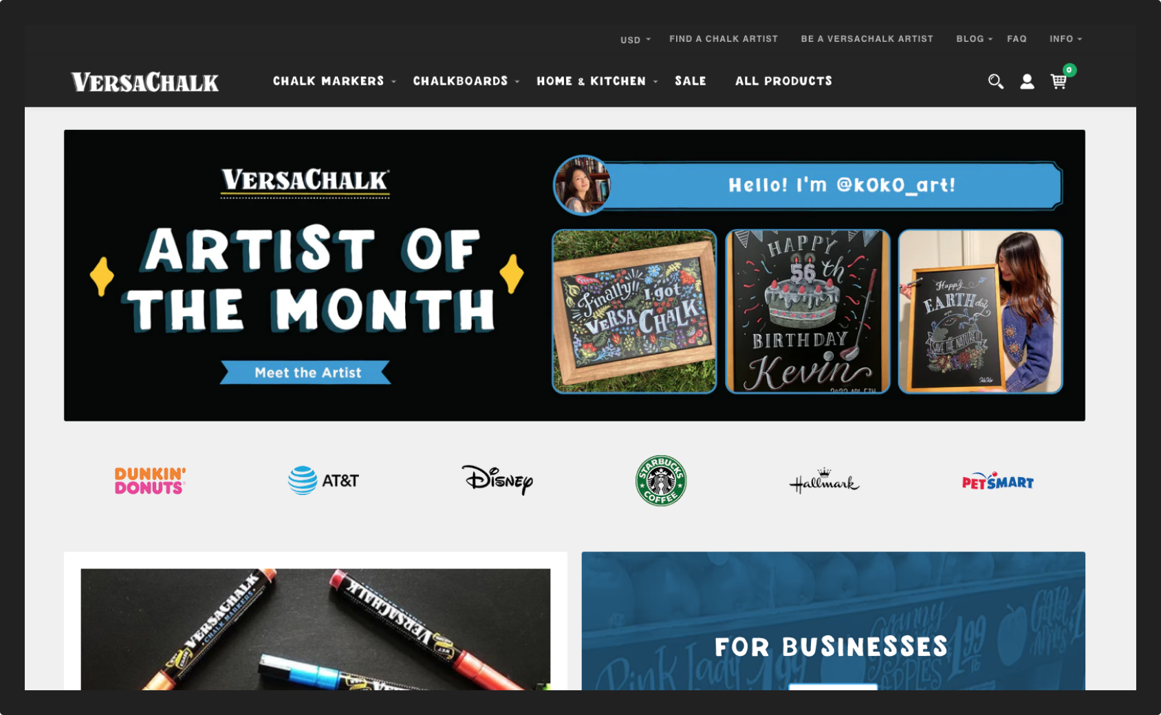
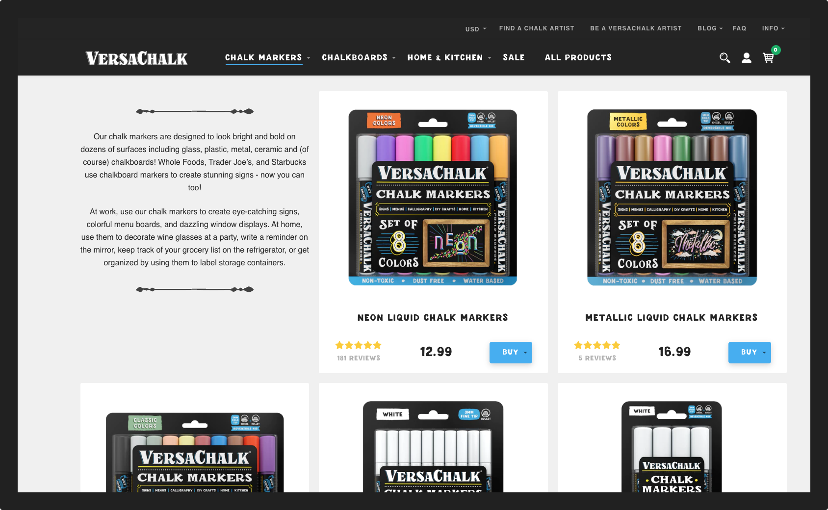
VersaChalk is an e-commerce brand that sells chalkboard art supplies to a wide range of creative users: DIYers, calligraphers, artists, and small business owners. Their main storefront, versachalk.com, is where most customer interactions and purchases happen.
My Role
I joined the team as the UX designer on a cross-functional crew that included a UI designer, developers, a content manager and a project manager. My role focused on grounding the design in real user behavior through research, testing, and UX improvements as we prepared to launch a newly redesigned site.
Research
VersaChalk operated with two distinct user groups across separate platforms:
B2B customers - business owners buying wholesale to decorate commercial spaces
B2C customers - individuals using the products for personal or creative projects
For this project, my focus was on the B2C side: understanding who our individual customers really were and what they needed from the website.
Creating strong user personas was critical to guiding design and marketing decisions. With the team, I defined three key goals for this work:
Avoid designing in a vacuum to make sure we weren’t building the site for ourselves
Uncover pain points and opportunities to use research to prioritize improvements
Shape a clearer marketing and content strategy, rooted in real motivations, not assumptions
To build a full picture, I pulled data from across our ecosystem: Google Analytics, Facebook Insights, website usage stats, Instagram behavior, and newsletter metrics. On top of that, I created a custom Typeform survey and sent it to our full subscriber base - over 16,000 users across email and Messenger.
Once I analyzed the responses, patterns quickly emerged. I grouped trends into three clear user archetypes:
The Creative Mom
The Professional Calligrapher
The Chalk Artist
These personas helped align the entire team around a shared vision of who we were designing for and gave us language and structure to make better product and content decisions.
A key part of the process was assigning names and photos to each persona. Personalizing them made the research more relatable and helped the team build real empathy. I see personas not just as artifacts, but as practical tools for better design.
Once finalized, we shared the personas across the company. I presented them to different teams, explained how they were built, and led a deep dive at our company all-hands to promote the project and its impact.
The insights challenged some of our assumptions. We ended up rethinking not just the site design, but the voice, content, and marketing strategy. These personas became a foundation for decisions across UX, content, and brand.
User Testing
““Why didn’t we do this sooner?
(What everyone says at some point during the first usability test of their website.)”
When I joined the team, the new website design had already been approved. There was no more debating layout or menu styles the site was just a few weeks from launch. But after months of work, the team was too close to the product to see it clearly. I led a final round of user testing to find out how real people actually experienced the site.
We defined four key goals for testing:
Get direct customer feedback to support final dev decisions
Ensure consistency across devices and browsers
Observe how users naturally navigated the new site
Identify critical usability issues before launch
One of the biggest challenges with any new site is that no matter how much time you’ve spent designing it, you can’t predict how people will actually use it. To uncover pain points and unexpected friction, I designed an exploratory testing plan: task list, observation sheet, and structured script. I prioritized tasks tied to key user flows such as product discovery, navigation, checkout, and support.
Because timing was tight, I ran six remote sessions using UserTesting.com. This gave us quick, high-quality feedback without having to source participants manually. I included both think-aloud tasks and follow-up surveys with multiple-choice and open-ended questions. The participants were selected based on the personas I had previously developed for the brand so we could focus on realistic scenarios and behaviors.
As I reviewed the recordings, patterns started to emerge. Some issues were minor; others were deal-breakers. Users struggled with certain navigation elements, misunderstood status messaging, and missed CTAs entirely on mobile. These insights were critical.
I documented all findings in Airtable to make patterns visible and help the team prioritize fixes. We used it to structure meetings, assign tasks, and track changes in real time. That visibility helped us move fast and make meaningful changes before launch.
Improvements
One of the key usability issues we uncovered was how the site handled out-of-stock products. Users who landed on sold-out product pages were met with a grayed-out “Buy” button and no next step. Based on feedback and analytics, we saw a clear pattern: visitors were dropping off as soon as they hit a dead end.
To fix this, I designed and implemented a new pre-order flow both on the frontend and behind the scenes. This involved:
Replacing the “Sold Out” button with a “Pre-Order” CTA
Adding a clear info block explaining pre-order terms and delivery timelines
Syncing the process with our Klaviyo email flows for automated confirmation and follow-up
Creating a Typeform contact form to collect pre-order details
Coordinating with operations and support teams to align on how to handle incoming pre-orders
This change gave customers a clear path forward even when inventory was low. It also aligned the front-end experience with backend logistics.
The result:
266 additional sales in the first two months
A 60% drop in bounce rate on previously dead-end product pages
This improvement created a better customer experience and helped the business recover lost revenue, fast.
Reflection
Watching users navigate our new site revealed blind spots we never saw internally. Their struggles shaped stronger navigation, messaging, and stock communication.
This project set a new bar for how we approach UX work, putting research and testing at the center of design decisions and using real user behavior to guide what matters most.


