📱 Building Shop WIBO
A mobile e-commerce platform designed to meet solo entrepreneurs where they are, no matter their tech skill or business size.
Intro
Workshop in Business Opportunities (WIBO) is a 16-week program that helps entrepreneurs build profitable, sustainable businesses. To expand the impact of the curriculum and support graduates beyond the classroom, our team was tasked with designing a dedicated e‑commerce platform. The goal: give alumni a simple, mobile-first way to sell their products and services—and grow a community around their work. www.wibo.works
My Role
UX Designer: led research, information architecture, and user flow design
Team: Carmen Wong (UI), Katherine Carreño (UX), Matthew Chen (UX)
Target Users
Our primary users were WIBO alumni - solo business owners running product or service-based businesses. Many were still early in their journey and managing everything themselves. They needed a platform that was mobile-friendly, easy to use, and didn’t assume technical expertise. The tool also needed to scale for future program participants.
The Challenge
Design a clear, intuitive experience that allows business owners to:
Register and create their storefront
Set up and manage product or service listings
Confidently sell to customers all from their phone
The experience had to feel approachable for entrepreneurs at all levels without compromising on core e‑commerce functionality.

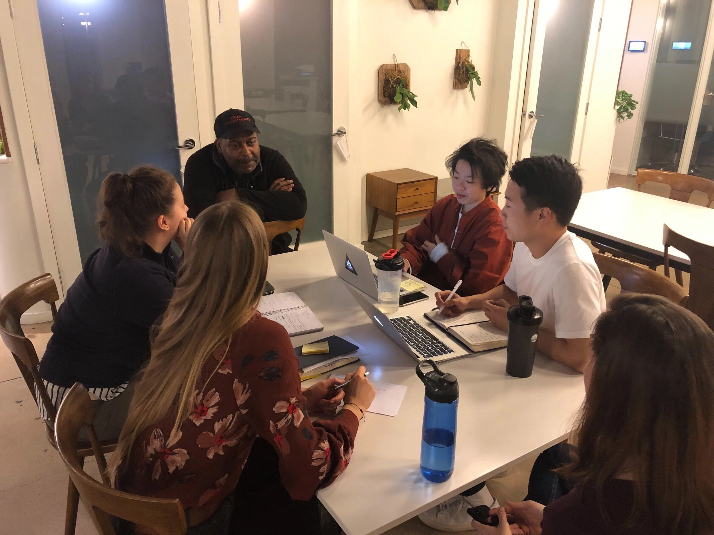
Research Phase: User Interviews
To understand how WIBO alumni run their businesses and how an e-commerce platform could support them, we conducted eight one-hour interviews, both in person and over video calls. These semi-structured conversations were guided by a few key questions:
How could an e-commerce platform impact the daily operations of WIBO graduates?
What are the biggest opportunities and constraints for solo entrepreneurs in this space?
What needs are being overlooked or underserved?
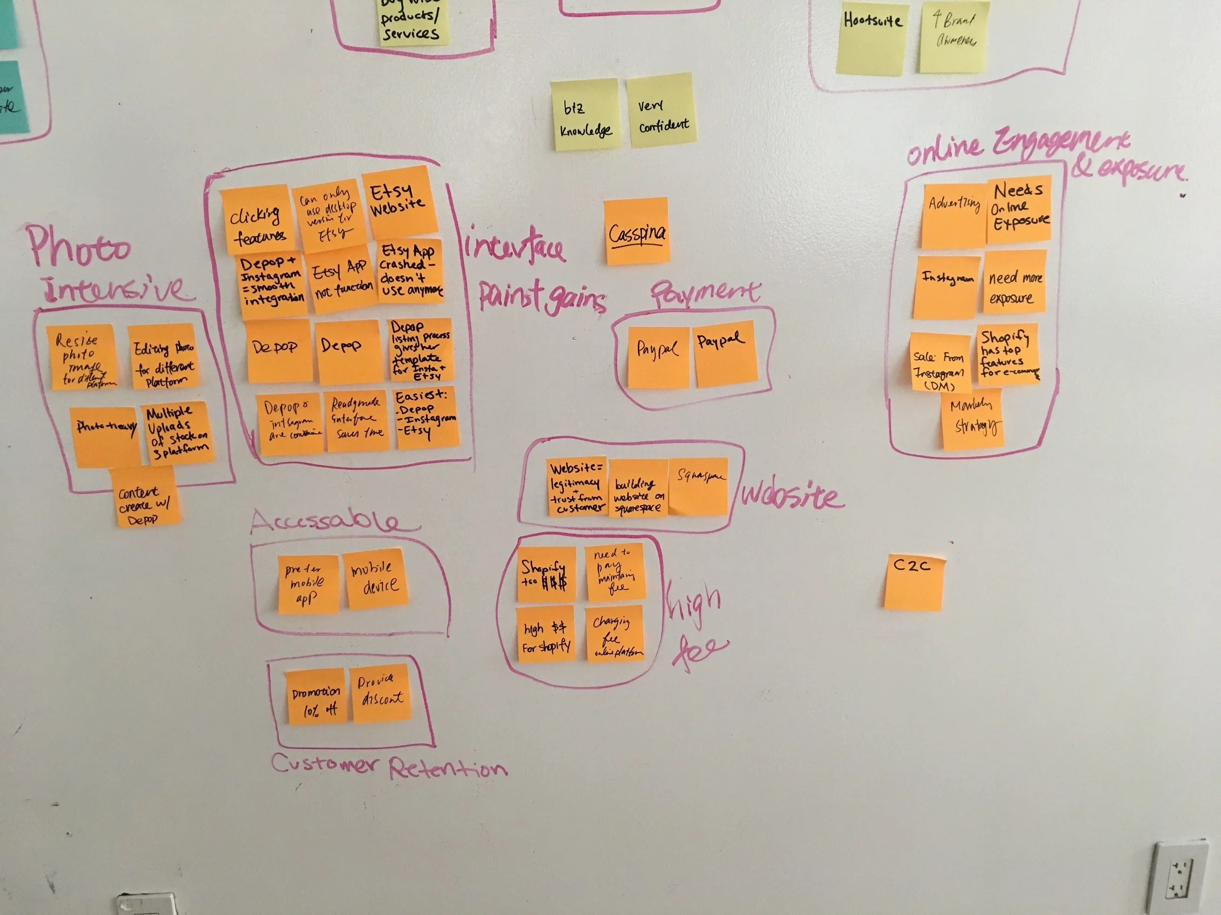
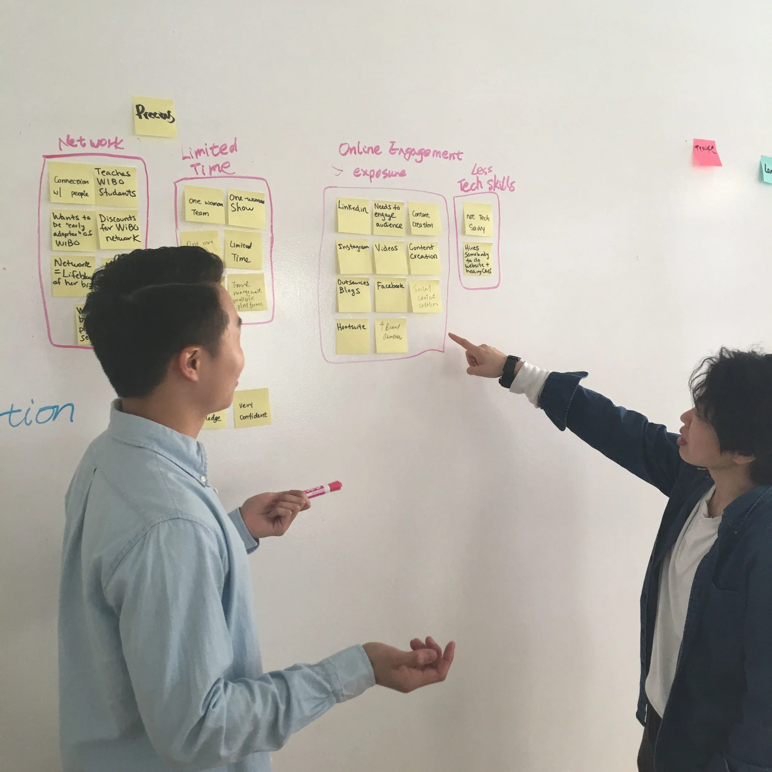
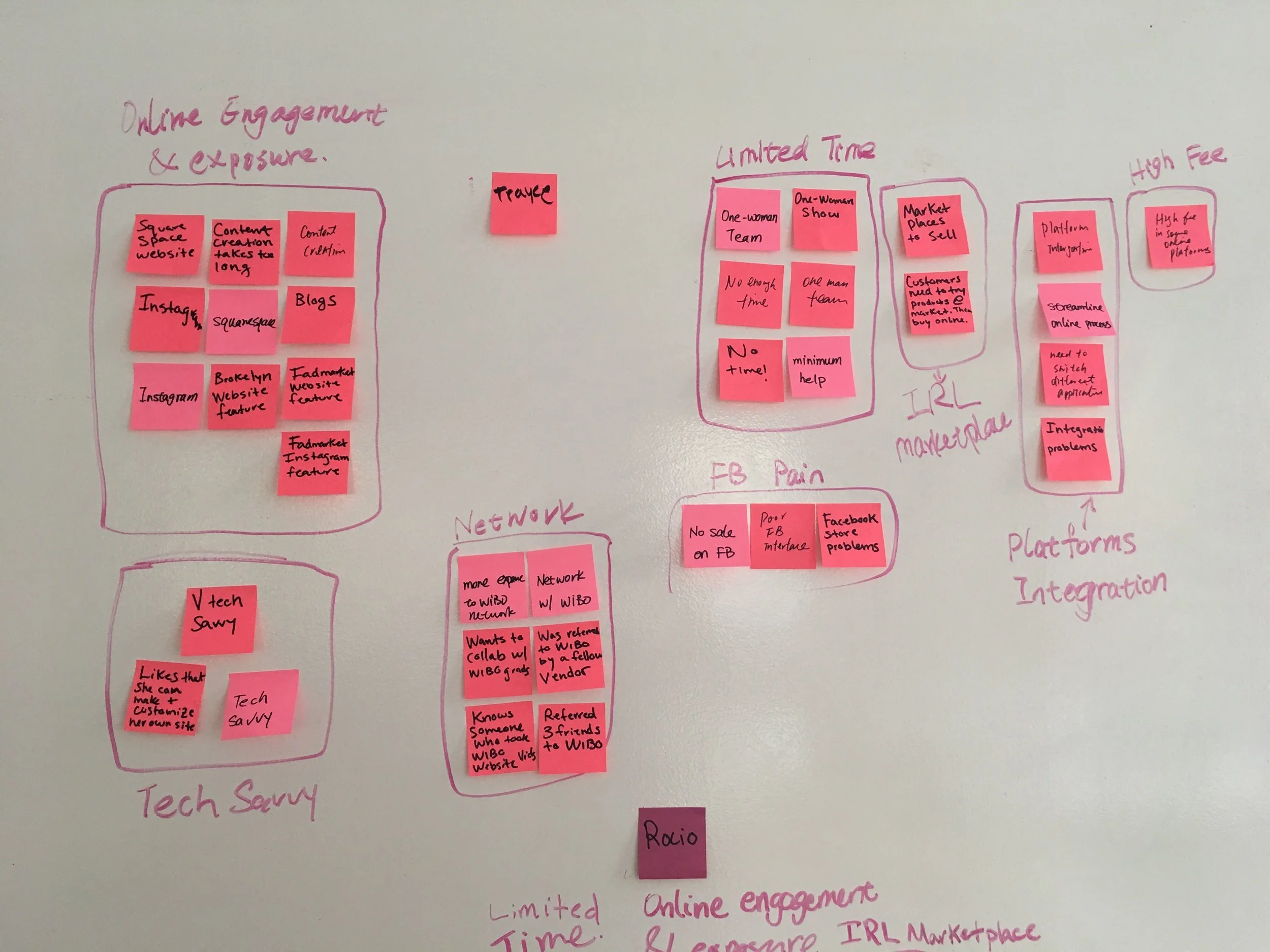
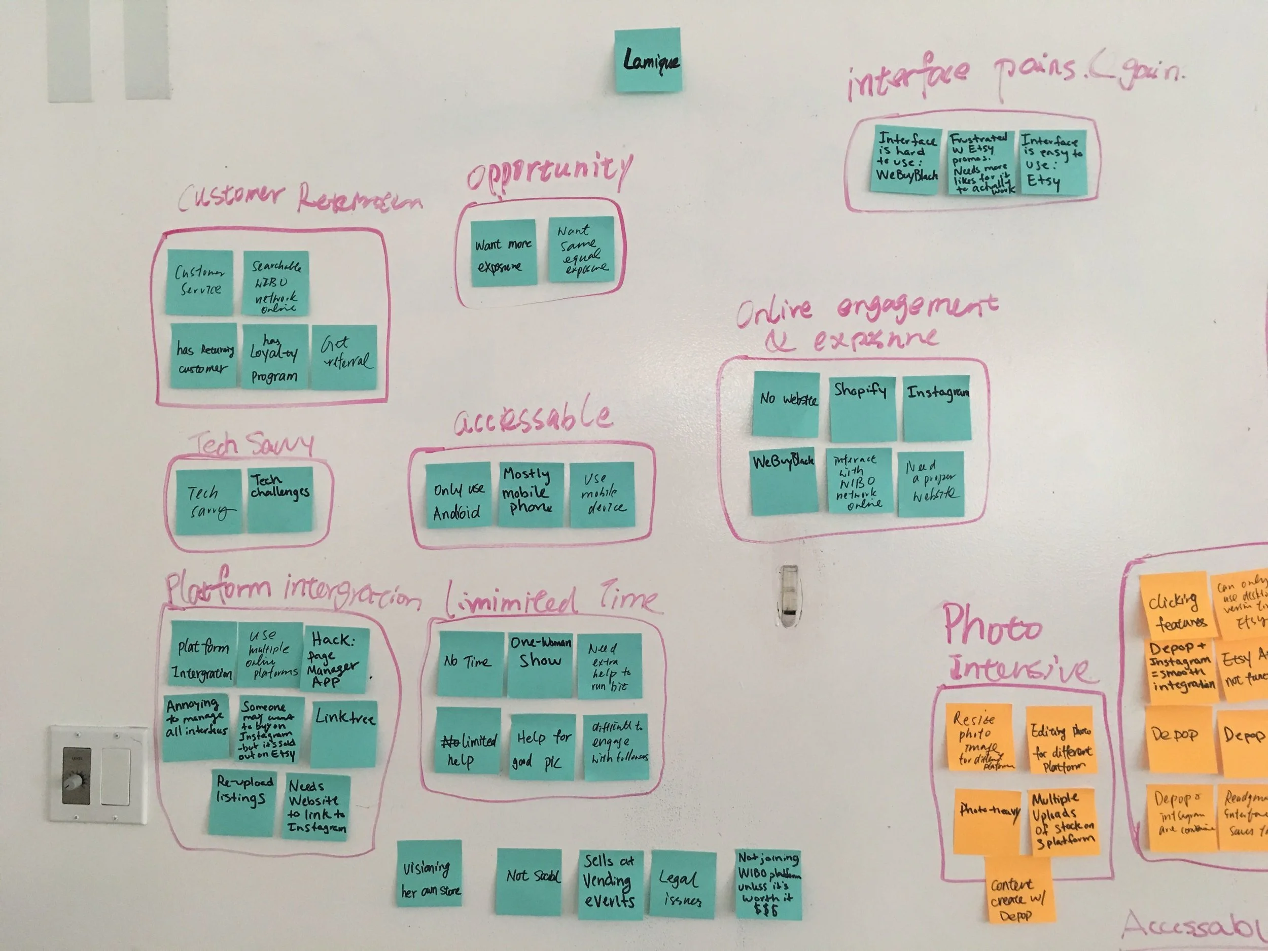
After analyzing the interviews, we identified several clear themes:
Entrepreneurs aren’t just selling products, many offer services as well, requiring different setup and presentation workflows
Technical confidence varied widely, some users were fluent in digital tools, others were overwhelmed by basic setup
They’re on their own, most alumni were building and managing their businesses without outside help
Mobile is central, nearly all users rely on their phones as the main tool for managing their business
Social media plays a major role , users often use platforms like Instagram or Facebook to promote and sell, so integration was essential
These insights gave us a clearer picture of who we were designing for and helped us focus the platform around flexibility, simplicity, and mobile-first usability.
Research Phase: Competitive Analysis
To broaden our perspective and inform design decisions, I conducted a competitive analysis of 10 direct and indirect e-commerce platforms. I focused on how each handled core tasks like account creation, onboarding, product setup, and store management.
The goal was to identify features and design patterns that consistently delivered value and determine which ones could be adapted for WIBO’s unique audience.
Some of the questions that guided my analysis:
How do these platforms structure their onboarding experience?
Which features are most valued by users (e.g., inventory tools, payment options, mobile controls)?
What UI patterns and visual structures support usability and trust?
This analysis helped us establish a baseline of user expectations, identify best-in-class features, and make intentional choices about what to include and what to simplify for our users.
Results from Competitive Analysis
Only 1 out of 10 platforms allowed users to sell services, not just products
8 platforms offered pre-designed storefront layouts to help entrepreneurs launch quickly
9 platforms included built-in inventory management tools
Only 4 platforms supported social media integrations for marketing and selling
These findings highlighted clear gaps and opportunities. Most platforms assumed users were product-based businesses with technical confidence, which helped us prioritize features that support service-based sellers and non-technical users.
Research Phase: User Personas
Based on patterns from our interviews, we created two personas that reflected the needs, behaviors, and constraints of our target users. These helped keep our design grounded in real context and guided decisions across flows, content, and layout.
Persona 1: A tech-savvy business owner selling physical products with an expanding inventory and prior experience using online platforms
Persona 2: A newly graduated WIBO entrepreneur offering services, with limited e-commerce experience and low confidence navigating digital tools
These personas gave our team a shared understanding of the users we were building for and helped us design with both simplicity and flexibility in mind.


User Journey Mapping
To better understand the end-to-end experience, I created a user journey that mapped key steps from registration to listing a product or service. This helped us surface potential friction points early and shaped the focus of our usability testing.
By visualizing each step, we could spot where users might hesitate, get overwhelmed, or drop off and plan targeted tests to explore those areas in more depth.
Feature Prioritization
We prioritized features based on user needs, research insights, and feasibility. Here's how we broke them down: (see chart below)
Ideation
“How might we design an e-commerce platform for WIBO alumni that delivers a seamless experience regardless of tech confidence or business size?”
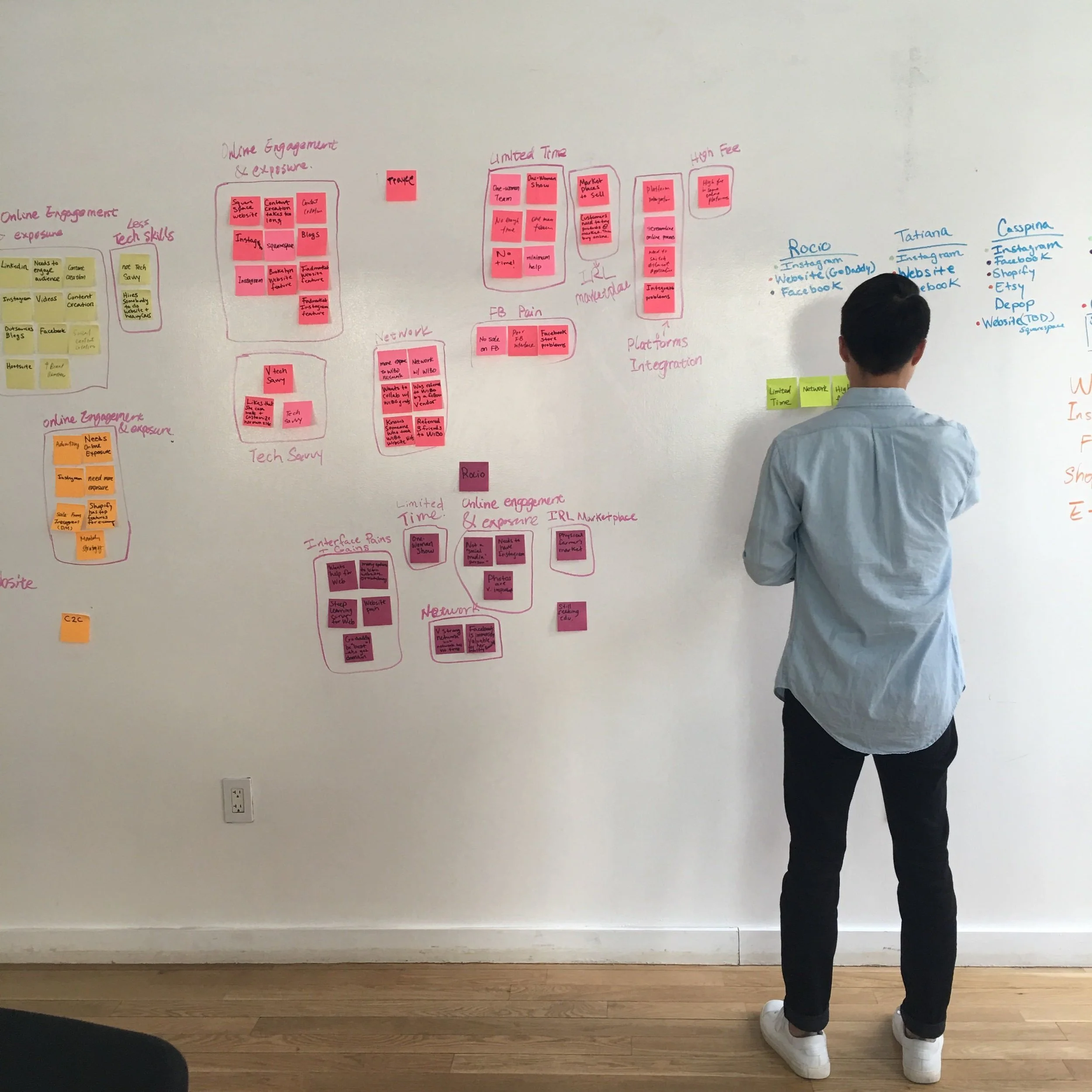
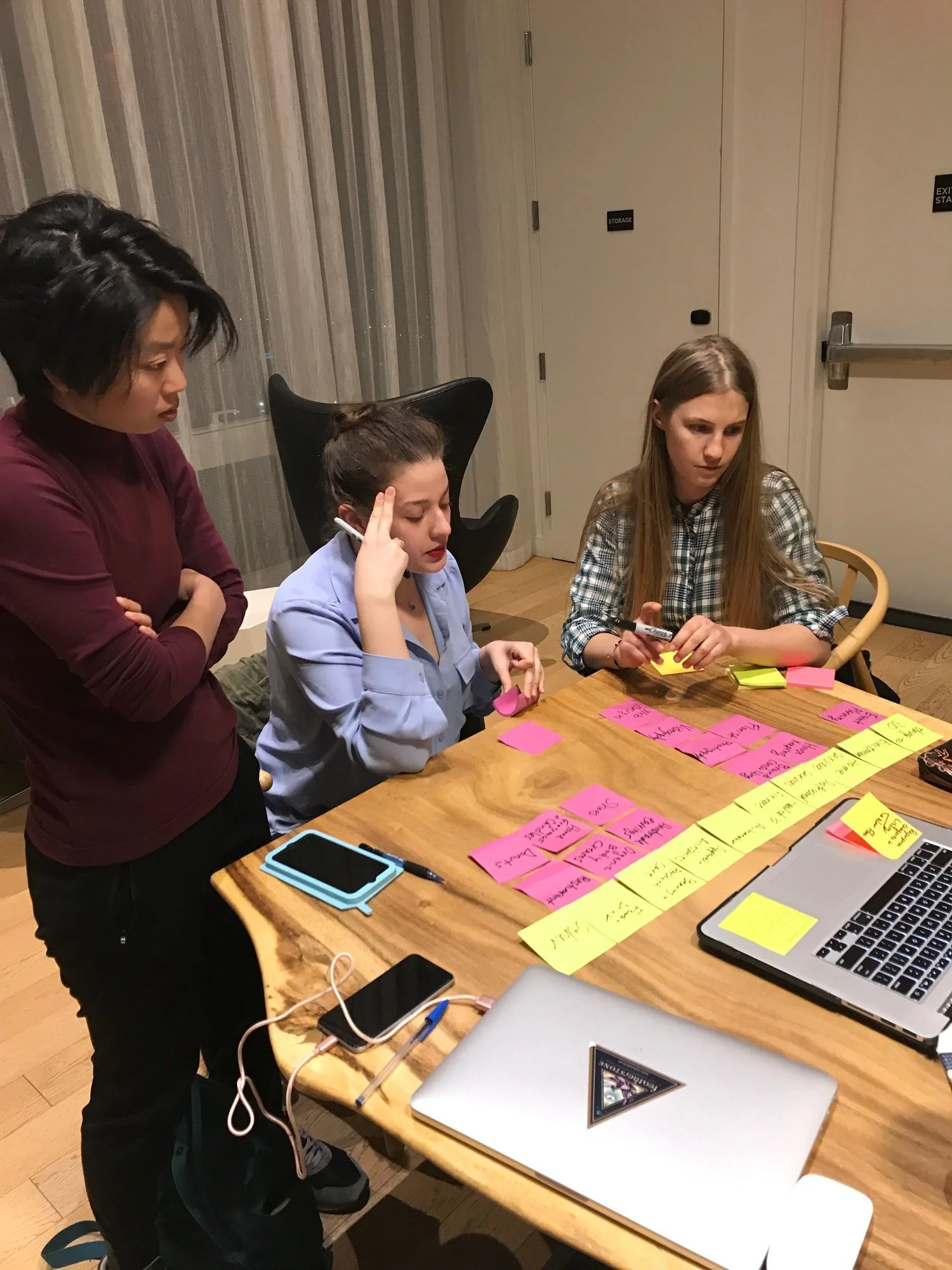
To answer this, we created an affinity wall to organize our research findings, spot common themes, and identify clear opportunity areas. This helped us focus our ideas and align on a design direction that could support a wide range of user needs without adding unnecessary complexity.

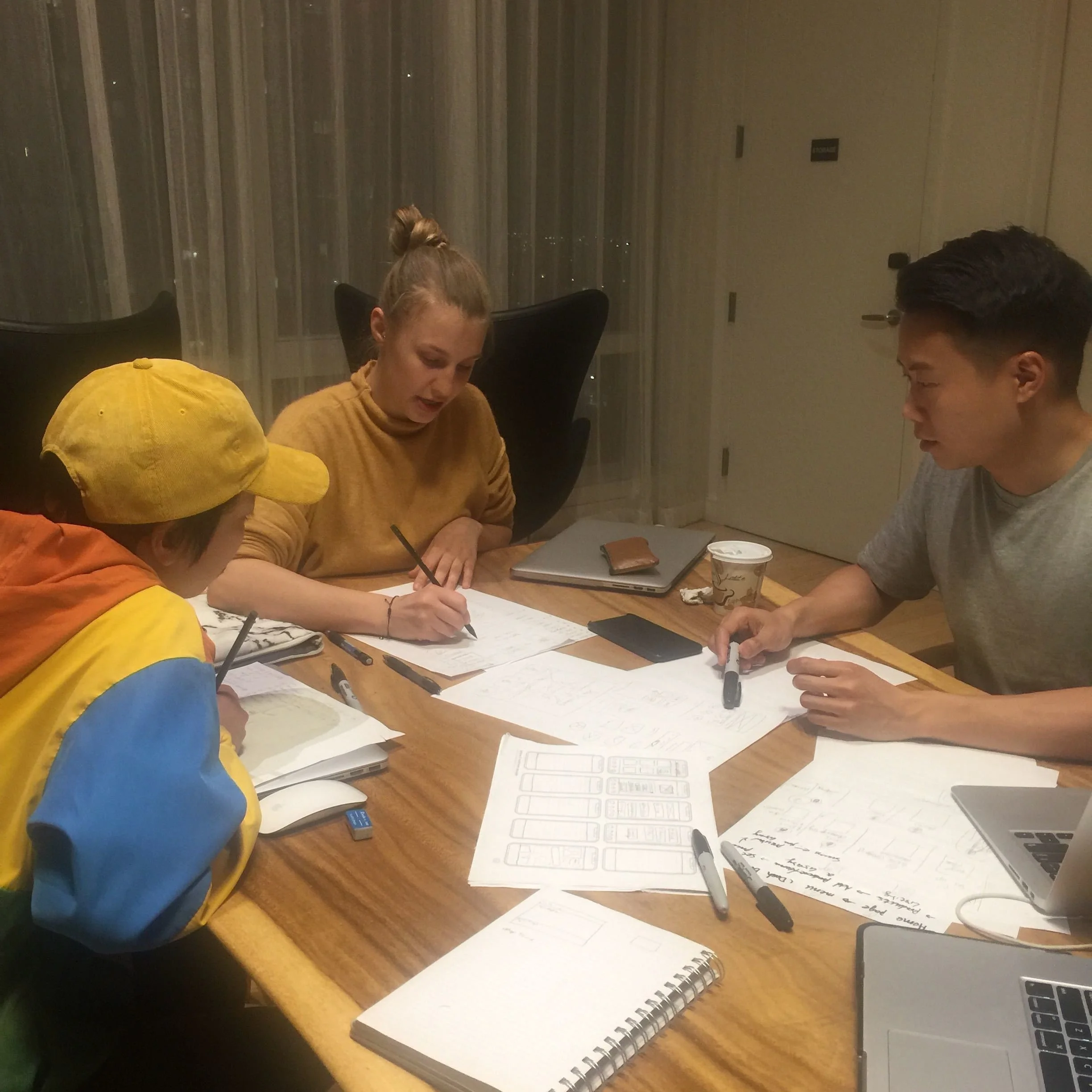
User Flows
Using our personas and prioritized feature list, we translated research insights into actionable design decisions. We broke the experience into three core tasks: onboarding, account setup, and product listing.
To ensure the experience felt intuitive and supported users at all confidence levels, we mapped user flows that outlined the steps and decision points involved in each task. These flows helped us visualize potential friction areas and build logic into every part of the journey.


Site Map
I created a site map to clarify how the platform’s front-end would connect with the back-end, and to ensure content was placed where users would naturally expect to find it. This helped us define a clear, intuitive navigation structure and understand how pages relate to each other.
The site map served three key purposes:
Establishing how navigation should be organized
Defining relationships between different sections of the platform
Creating a foundation for development estimates and future wireframing
Testing
To validate our assumptions from the ideation phase, we tested low-fidelity prototypes with real users from our target audience. We used Sketch and InVision to prototype two critical workflows: onboarding and listing a product. Based on our research, we focused on mobile, since most users relied on their phones to manage their businesses.
We recruited participants with varied business types and tech experience. This diversity gave us valuable insight into how the platform might perform across different user groups.
During each session, we observed where users hesitated, got confused, clicked in the wrong place, or requested features that hadn’t yet been included. We also noted what they found intuitive or helpful.
To organize our findings, we sorted feedback into three categories:
User Interface - visual clarity, buttons, layout
Content - clarity of instructions, language, terminology
Features - requested elements, missing functionality, positive reactions
Several key trends emerged:
Button colors lacked clear visual feedback, leaving users unsure whether they could proceed
Category selection confused five out of six users, indicating a need for better structure or guidance
Users consistently valued the presence of setup guides to walk them through storefront creation
Social media integration was positively received by all participants
This feedback gave us clear direction for the next round of iteration, focusing on clarity, simplicity, and supporting less tech-savvy users more effectively.
Design Revisions
Following our first round of testing, we identified several areas that needed revision based on clear user feedback. These updates focused on improving clarity, reducing friction, and better supporting users with different levels of experience.
We revised the following elements:
Page structure to improve content flow and reduce cognitive load
Visual design consistency to create a more cohesive, intuitive interface
Guided text and CTAs to better support users through each step
Category selection to clarify the difference between selling a product or a service
Listing fields to simplify input without overwhelming users, while still capturing essential information
These revisions helped align the platform with real user behavior and strengthened the overall experience for both new and returning business owners.

Refinement and Final Testing
After our first round of testing, we conducted comparative research to see how other e-commerce platforms addressed the challenges our users faced. This helped us identify best practices we could adapt and incorporate into our own solution.
Using both the user feedback and competitive insights, we revised our prototype and increased its fidelity in preparation for a final round of testing.
During this phase, user response was overwhelmingly positive. Business owners were engaged and expressed genuine interest in using the platform. Most importantly, all participants were able to complete the assigned tasks confidently, without confusion or follow-up questions.
The improved clarity and structure confirmed that the updates made the experience more intuitive, accessible, and aligned with users’ real-world needs.
Final Designs


Further Opportunities
Shop WIBO proved to be both flexible and valuable for WIBO graduates and program leadership. Based on our work, we identified several opportunities for continued growth and long-term impact:
1. Integrate Shop WIBO into the WIBO curriculum
Turn the platform into a hands-on learning tool. We recommended creating video tutorials to be included in the 16-week workshop, guiding users through setup, integrations, selling, and key features. A step-by-step onboarding system using contextual popups could walk users through the platform in real time and help them discover tools they might otherwise miss.
2. Evolve the category system with real user data
We designed the category system using a flexible tag model. By collecting data on the most frequently used tags, the WIBO team could refine or rebuild category structures based on how users actually describe and sell their products or services.
3. Use the platform as a promotional channel for WIBO Academy
Shop WIBO’s homepage could become a direct line of communication between the program and its users. News, updates, and educational resources could be featured in a scannable, mobile-friendly layout. The dashboard also presents an opportunity to surface WIBO Academy resources or promote upcoming events.