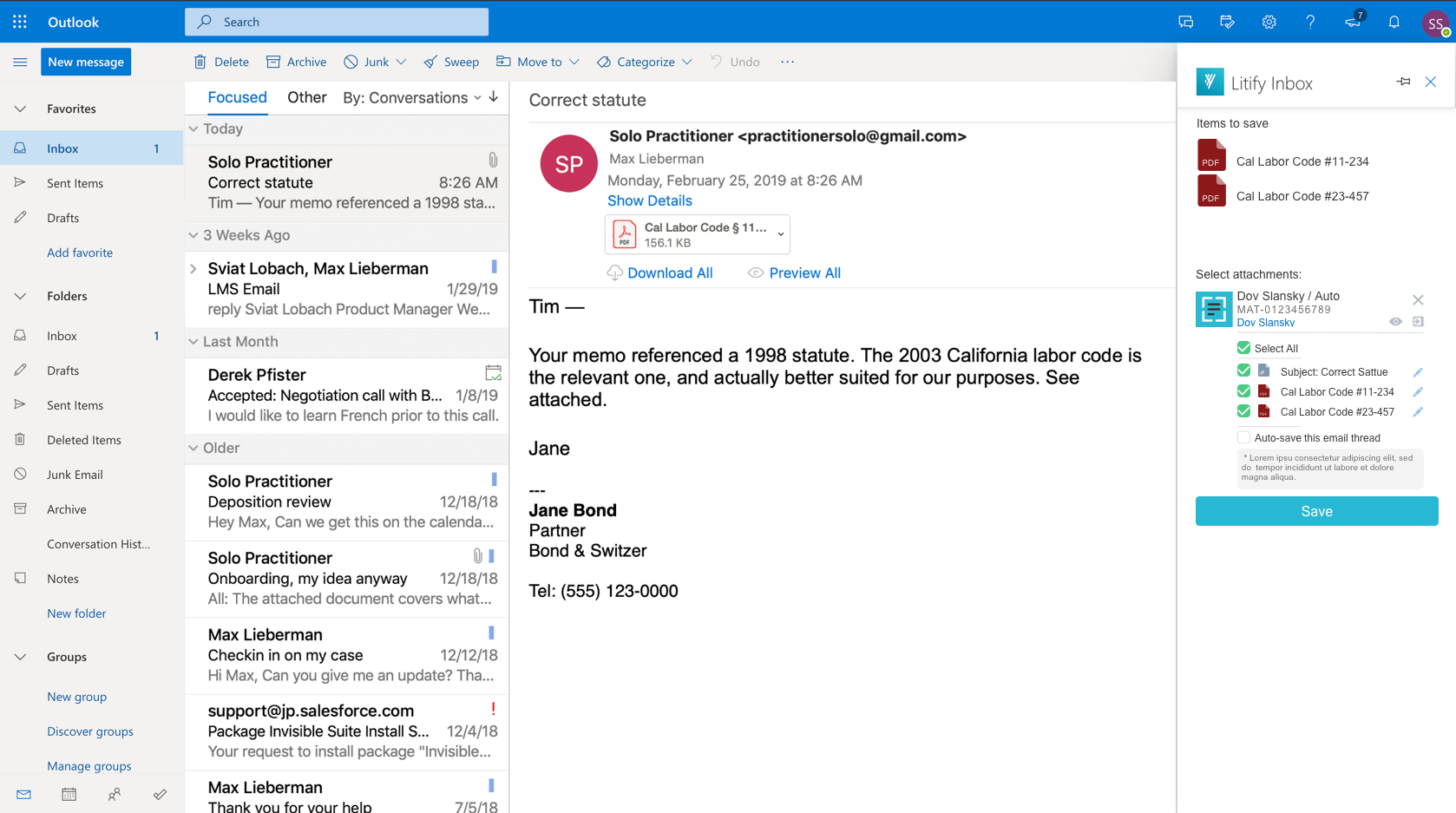
Litify Inbox
Outlook App For Legal Case Management
UX Research, UX/UI Design
Intro
Inbox is an Email Extension app that helps legal professionals to keep Outlook emails and the calendar in sync with Litify (Legal Case Management Platform Built on Salesforce).
Target Users: Attorneys, attorney assistants, and case managers at personal injury law firms.
The original version of the product had a lot of technical problems and received many user complaints about not intuitive design, information overload, and poor customer support. To solve all the problems at ones, my team was given a task to rebuild the product from scratch.
My Role And My Teammates
My role in the project involved leading extensive user research, analyzing feedback from the customer support team, facilitating feature definition, designing mockups, creating and testing prototypes, collaborating with engineers to build out the new intuitive app.
I worked with Magda Panunzio (Product Manager), Jake Doetsch (Engineering Manager), Chase Stephens (Engineer), Mark Morales (Engineer), Marcus Hobbs (Engineer), and James Daniels (QA Engineer) to build V.1 and define future opportunities for V.2.
Process
I followed the User-Oriented Design process to learn how Litify users may want to organize their workflow based on their preferences. I also interviewed the executive and customer success teams, and conducted competitive analysis.
Letting the findings from the research be our guide, my team and I brainstormed and tested several design solutions. After evaluating testing results we picked the most successful ideas and came up with the final version of the design that went into development.
Constant checks and iterations during the development helped us to stay focused on user needs and get additional information when needed.
Research and Data Synthesis
To come up with a functional, data-driven design I conducted exploratory research, which included: competitive analysis, user and stakeholder interviews.
Competitive analysis
This method was a great way to broaden my understanding of the field. I compared UI and key features of six (6) outlook add-in competitors.
The goal was to define the most popular and useful features across different platforms and outline those that would work for our project. Some of the guiding questions were: What is the working mechanism of these apps? What are their star features? What are the visual structure and user experience?
Key Findings
90% Allow renaming subject line and documents
100% Allow saving attachments to designated folders or integrate with a document solution
4/6 Offer field customization for objects and search on user level
90% Implement UI elements outside of the sidebar
90% Have straight-forward feature of attachment documents to outgoing correspondence
4/6 Offer various filters for search (example: search in recent files only)
EBSTA - is the only app offering highly desirable bulk saving emails to a matter
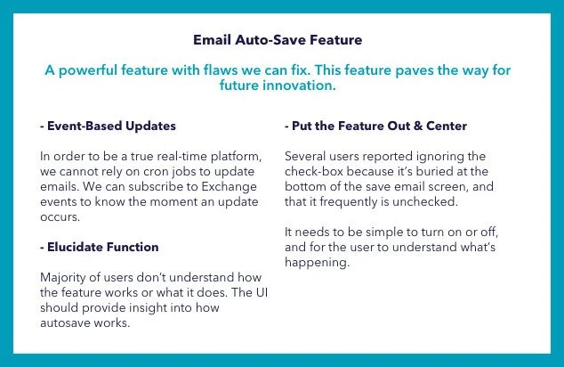
CIRRUS - is the only app that has fully functioning auto-save for email and files.
User and Stakeholders Interviews
I interviewed 7 stakeholders to:
Understanding the context in which users perform their daily tasks
Validation of our assumptions and unearthing hidden problems and/or opportunities
Understanding the most pressing issues and pain points
Collecting users feedback on possible improvements/updates
And 9 Inbox Users to collect data about :
The issues are directed to the customer support team most of the times
The technical limitations exist in the current version
The short and long term product expectations of the executive team
The app's (dis) advantages in the sales process
The expectations of key clients
Affinity Maps
I took all the collected data from the interviews and broke it down into Feedback, Behavior, or Features, identified affinities, and separated them into discrete product areas. I started the process using paper sticky notes and converted them into digital form (Miro) later to collaborate with some of my remote teammates. Together, we analyzed each group of findings and formulated design requirements as a conclusion.


User Personas
The next step was creating user personas that would reflect our findings from interviews and help with decisions on later steps of design. After organizing and analyzing responses I highlighted the most noticeable patterns and summarized them into 2 archetypical groups:
A case-manager from a large law firm with a well-defined work process
A tech-savvy executive of a small personal injury firm with a wide variety of responsibilities

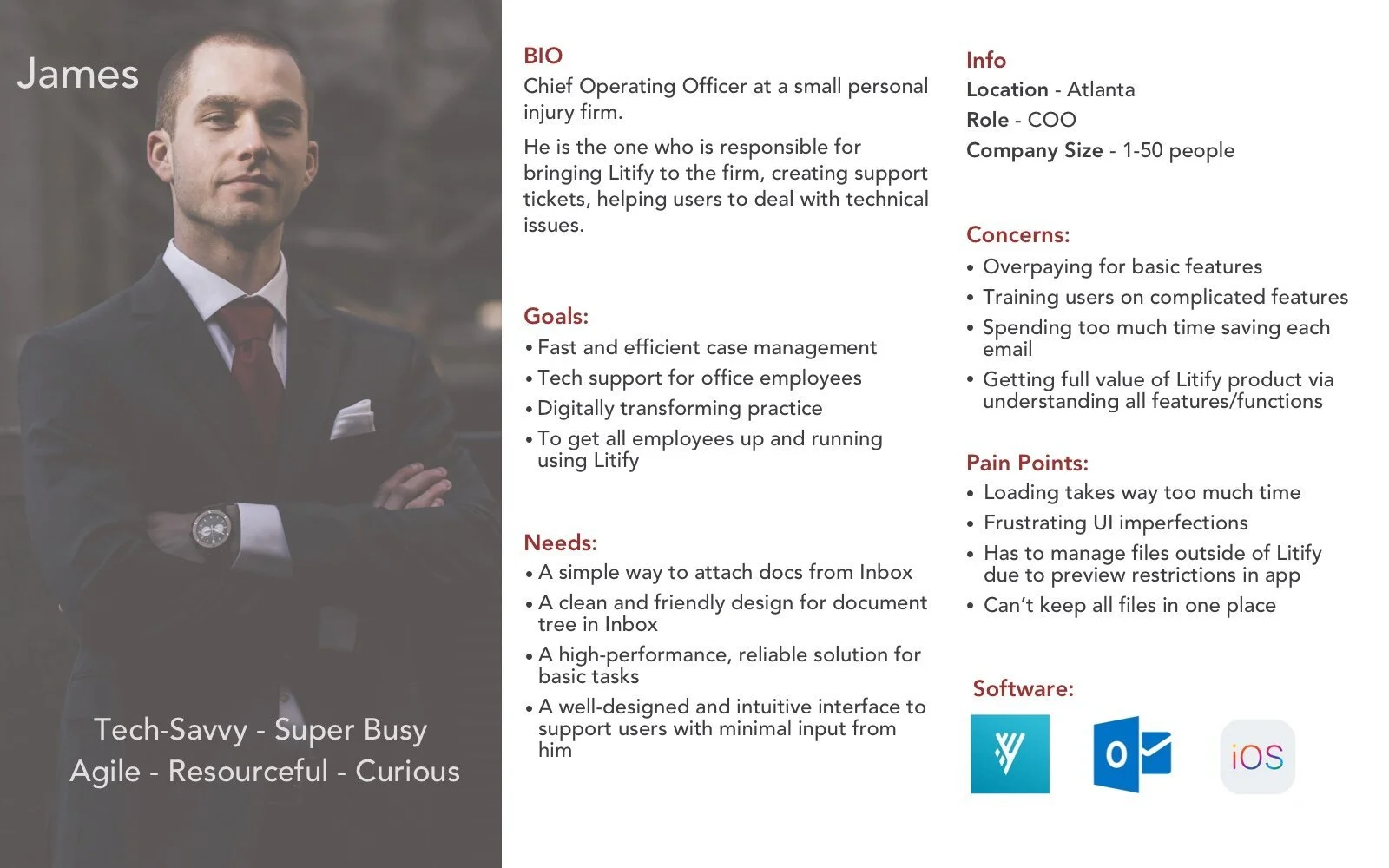
Conclusion
Having such diverse tech users for the product leads us to the necessity of designing flexible and, what is the most important, easily scalable product. That means expanding the initial user group outside of a personal injury law firm and designing the product with a scalable system in mind. Some of our users need more guidance than others. It's important to provide the simplicity of usage for any type of performed flows.
robust configuration layer with adjustable filed types and objects for a scalable system
flexible permission settings for different companies sizes
clearly formulated error messages for seamless troubleshooting
Feature Assessment and Direction of Design
Based on the user’s feedback and the takeaways from the conversation with the customer success team, I defined 6 main areas for improvement.
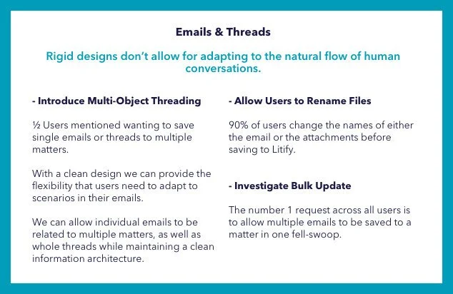
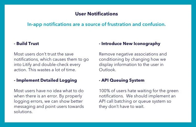
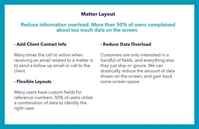
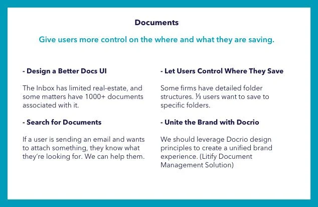
Two of the most challenging ones were the document module and multi-object threading. For those, we had some ideas that needed user validation.


Technical Research
During the research process, we also identified some technical unknowns which had to be explored. We needed to learn about using the Salesforce Lightning Design System and Outlook Design Guide, ability to inject Litify content & iconography directly into the Outlook app or browser, and the concept of related objects in Salesforce.
The outcome of this user research and technical exploration determined the finalized feature set. After days of collaborative work with engineers, my team and I came up with the V.1 Final list of Features, Design Requirements and the decision to use the Salesforce Lightning Design System (SLDS).


Design, Testing, and Development
Phase One
I love collaborating with my teammates and explore different perspectives from designers, engineers, and managers. To get different ideas from my coworkers I organized a design studio exercise. Given one use case as an example, each of the participants sketched their vision on how the app's UI could look like. We reviewed every drawing, gave each other feedback, asked questions, and voted on the best solutions. Many of these ideas were later used by me in prototypes.
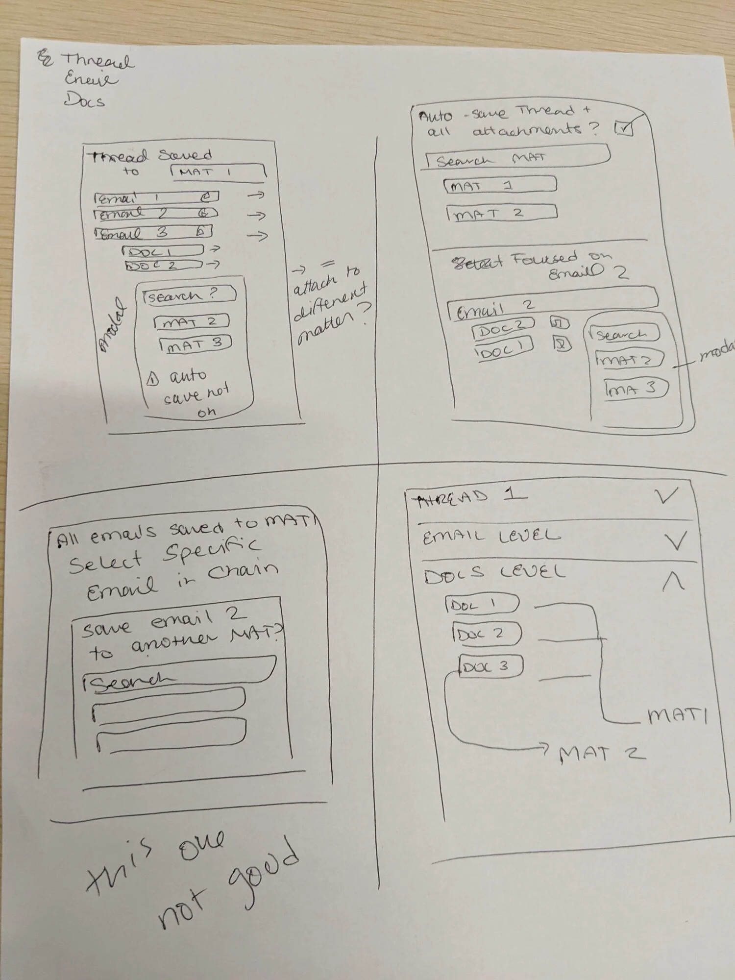
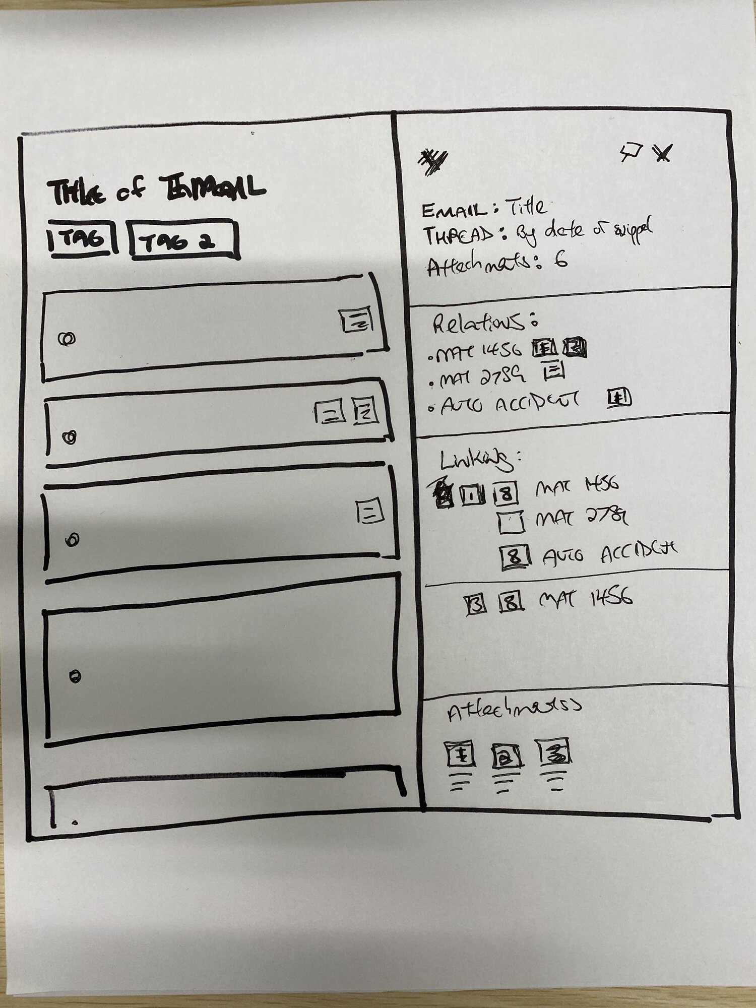

The first prototype included a view of available files for saving, nested structure of matters and related files, simple typeahead search with two types of objects.


I tested these mockups with several case managers and validated the need for rethinking the concept. The most important areas for improvement were:
the save flow wasn't straightforward for a user due to many available actions on the screen at the same time
users couldn't distinguish saved threads from emails
users weren't confident navigating through the nested documents and didn't understand where the files are saved
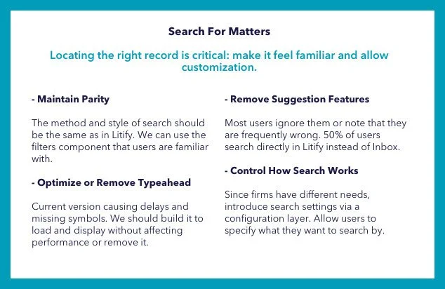
needed filters for the search to narrow down results
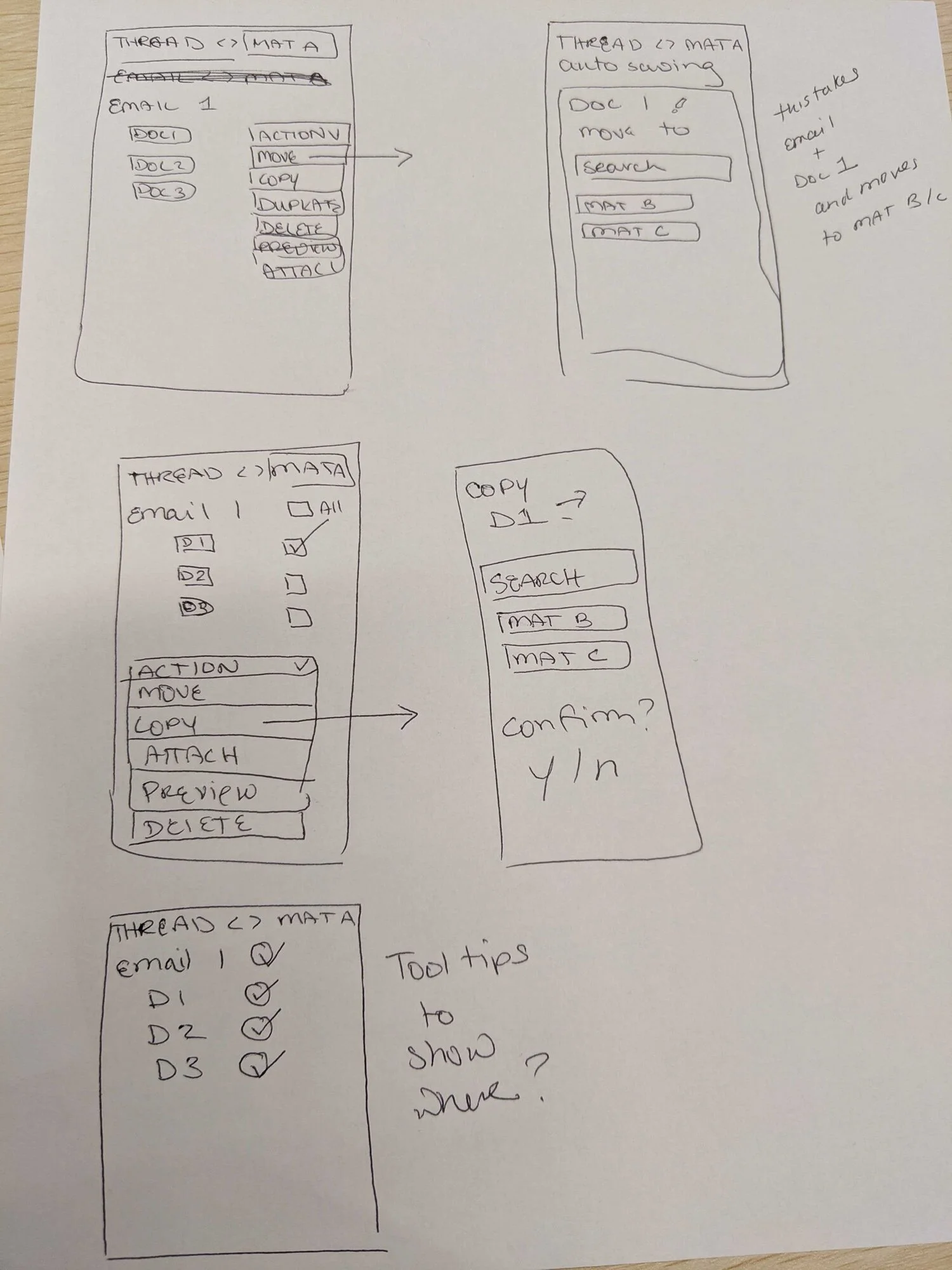
Phase Two
Based on the findings and the feedback I decided to take a step back and to do another whiteboarding session. The main challenge was figuring out how to represent the saved status of the object based on given conditions. The visual architecture had to respond to several conditions:


After defining the logical flow I created an extended user flow that would articulate all possible scenarios to engineers and be a guide for the backend architecture planning.
The second prototype included the new concept of displaying saved matters in the shape of floating cards and the classic folder-view document module. This version gave the app a fresh clean look and provided insights on the matter status at glance. I incorporated search filters by type of an object and last activity because these two criteria were requested by the majority of users. Another change was guiding our user through the entire process of saving a matter by hiding or displaying certain modules step by step based on the conditions.


Testing at this stage was a big success. I reached out to 7 users from different law firms and asked them to perform a few tasks using the prototype. The feedback was very positive, testers were excited about the new concept and layout, simple design, and guiding interface. Testing validated the working concept of floating cards. A few elements still needed a change. We learned that:
The available files module at the top of the screen is confusing and blocking search. We decided to remove it and locate the search module as the first element of the screen.
Document module needed visual clues for different file types and the opportunity to preview a file before attaching it to an email to avoid mistakes.
We needed to give our users a way to recover from an error by removing email or thread from an object in Salesforce.
We needed to let users change what and where they save files at any point in their journey. The decision to incorporate flexible toggles available after clicking the matter cards.
Phase Three
The final design included all the feedback we could technically implement into the v.1. The rest was captured in a list of potential features for v.2. I also updated all the elements in the prototype using The Salesforce Lightning Design System. This helped to achieve the goal of dynamic styling for different clients and parity with the main Litify product that is built on Salesforce. After the final round of testing and validating the working concept, we moved to the development phase! Litify Inbox was included in the Litify solution package as well as considered to travel as a standalone email management tool.


Reflection
Design System Advantage.
My collaboration with engineers is one of the essential aspects for shipping a product. Using the well-crafted design system helped me to handle accessibility, smooth and fast developer hand-off, visual consistency, dynamic styling, and parity with the main Salesforce product. Offering our users familiar feel and look led us to success, making the interface intuitive and easy to navigate through.
Less is more.
The biggest problem of the first product was informational overload. Although each feature of it was brilliant on its own, mixing them all together on a tiny screen made the experience overwhelming and impossible to test the power of the app. Using research to learn what the most important tools are and focusing on building it helped us to satisfy our users and solve their problems.
Flexible and scalable product.
We learned that each personal injury law firm is different and has its own workflow. This discovery helped us to form an idea of a scalable and flexible product that gives Litify the opportunity to expand the market far beyond just one industry.