Versachalk
E-commerce Website For Art Supplies
User Research, User Testing
Intro
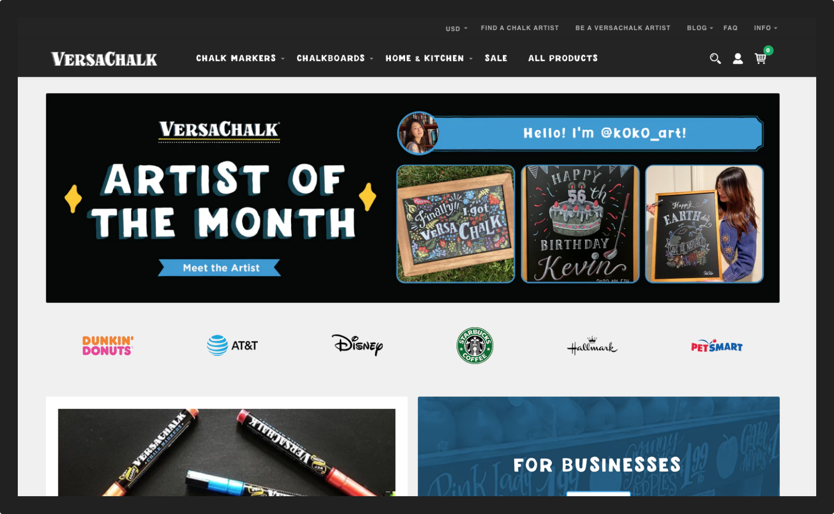
Founded in 2014, VercaChalk is an e-commerce business that offers innovative chalkboard products for aspiring sketchers, old school artists, entrepreneurs, and DIY-ers. One of the biggest channels for sales and interactions with customers is versachalk.com. I worked alongside a UI designer, developers, a content manager, and a project manager. I had the opportunity to take part in launching a new website for VersaChalk.
My role: UX Designer
Team: Collaboration with a UI designer, a developer, and a content manager
Timeline: Summer 2018
Research
Versachalk is using a different marketing approach and two separate e-commerce platforms for B2B and B2C scenarious. I had to segment our users to two main categories. the B2B group includes business owners that use our products to decorate their commercial spaces, usually purchasing in wholesale. The B2C group includes customers that use our products for personal needs. This time I had to focus on the second group and create a portret of a user for whom we are trying to solve problems on our B2C website, summarize trends into several archetypes.
Creating user personas was an essential step in the website relaunch, together with my team I defined the main goals for doing so:
Prevent “Grounding”: designing a website for ourselves instead of for our users
Highlight pain points and opportunities to tailor our product to our users
To form a clear vision of our user's needs and motivations for creating a powerful marketing strategy that will be satisfying for customers and lucrative for the company.
To gather data about our customers I’ve used all existing information from available sources: Google Analytics, Facebook Insights, VercaChalk Website statistics, Instagram, and Newsletter subscribers analysis. In addition to it, I’ve created an online survey in Typeform and sent it to all our email and chatbots subscribers (over 16.000 people).
My goal was to organize metrics based on real data about customer demographics and online behavior in a comprehensive form.
After gathering and analyzing numbers and responses I’ve highlighted the most noticeable trends and created personas of 3 target users – a creative mom, a professional calligrapher, and a chalk artist.


One of the important aspects was to give personas names and find photos fitting the profile. Personalization was an effective way to build empathy between my team and users. I believe personas are instrumental in building good design.
After I finalized personas my team and I present relevant subsets of personas to additional teams in the company.
During these presentations, I explained why we built personas and how I came up with these groupings. At a company all-hands meeting, we gave a deep dive into the process and results to promote the project.
The collected data brought us to unexpected explorations about our target users. We had to not only redesign the majority of our assets but also rebuild the whole UX process and develop a new marketing strategy. Together with my team, we used these personas to make design decisions while relaunching the website, to find the voice for our brand, to create written and photo content that resonates with our audience.
User Testing
““Why didn’t we do this sooner?- What everyone says at some point during the first usability test of their website.””
The new website design was already approved when I joined the team. There were no debates about the best shape of the menu icon or background color. It was a couple of weeks before the site would go live and we needed to find out if it worked. After working on the project for several months my team couldn't see it freshly anymore. I had the opportunity to take a lead of the user testing process and watch other people trying to navigate on the site. Firstly, we defined the main goals of the testing project:
Get customer feedback to support development cycle
Ensure consistency across devices
Explore how people use the new version of the website
Identify key areas for optimization
One inevitable challenge of launching a new website is not being able to accurately predict how people will interact with it. To build an understanding of where users encounter difficulties, I conducted some exploratory research. For this round of tests, I've formulated a task list of actions participants have to try to perform, an observation list, and a testing script.
When the user testing conducted two weeks before the website launch it becomes a time-sensitive project. To get rapid customer feedback, evaluate the results, and make changes I used UserTesting.com. Using a third-party company eliminated the need to recruit people. In addition to capturing video and audio, I included survey questions with both multiple-choice and long-form responses. To get the most accurate and valuable feedback I conducted 6 user testing sessions. While defining an audience for this purpose I kept in mind the user personas I've created earlier for this brand. I listened to the study participants as they narrated their actions and decisions using different gadgets and browsers.

As I gathered observations, I noticed some patterns of where users encountered issues. Some of these concerns were critical for the website's smooth functioning and seamless user experience. Documenting these patterns helped me to create specific discussion points for team meetings, and identify opportunities for improvement. Additionally, the results allowed for the organization, structuring, and prioritization of the existing problems. To display visually existing issues and track the progress of fixing them I used Airtable.
Improvements
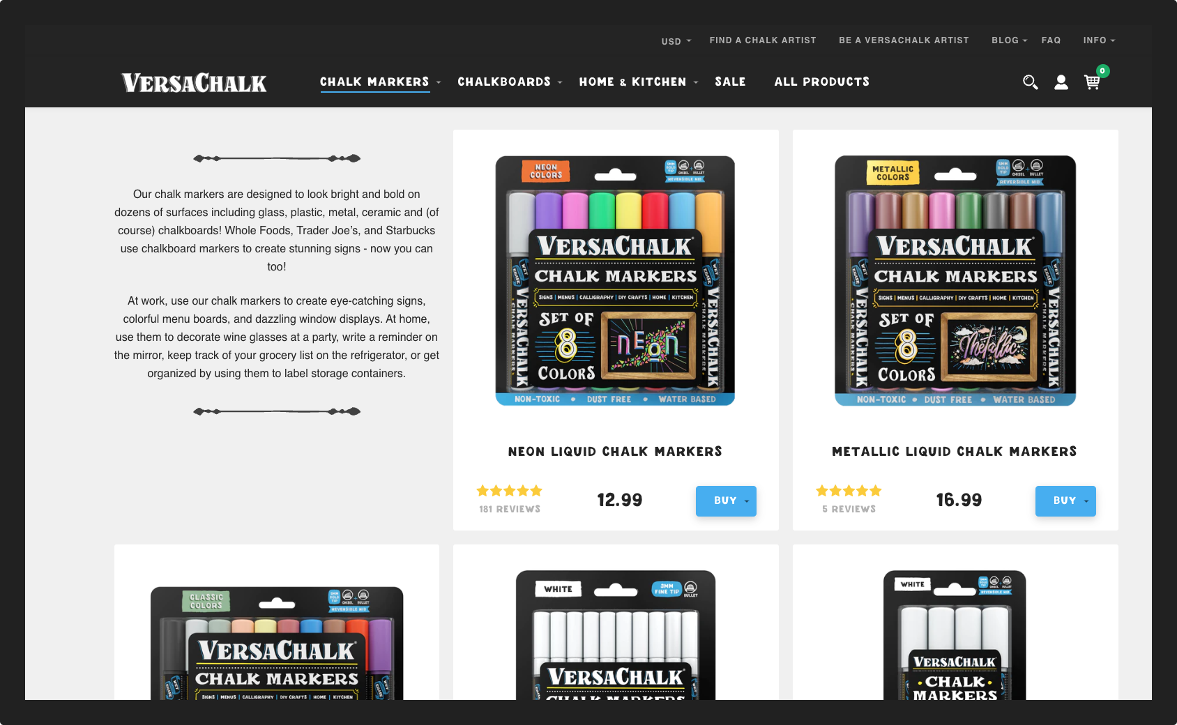
One of the many discovered areas for improvement was a product page with a condition "out of stock". Based on users' feedback and website statistics we discovered that a significant percentage of website visitors are bouncing out due to the unclickable "buy" button
To organize a working pre-order process for the Versachalk meant creating, designing, and implementing an internal optimization system for handling an out of stock product on the website as well as user-facing automated flow. To do so I designed and implemented several website UI changes:
Conditional, when out of stock - replaced button "sold out" with "pre-order", added info block with pre-order terms and conditions;
synced the process with an email support flow in (Klavio
created an additional contact form in Typeform
made sure the operations and customer support teams are well informed about their actions in case of selling out of a product.
Implementing this process allowed the company to have 266 additional sales in the first two months and reduced the bounce rate by 60%.
Reflection
By watching real people using and fumbling through the new website, I quickly identified areas that needed the team's urgent attention. In response, we made some significant changes in navigation, wording, presented content, and handling out of stock products. This project became a solid base for my team's task planning for the next few months and proved the colossal value of user testing.