Wibo Shop
Mobile E-commerce Application
UX Research, Information Architecture, UX/UI Design
Intro
Workshop in Business Opportunities “WIBO” is a 16 weeks “How to Build a Growing Profitable Business” workshop.
In order to bring the company to a new level and support alumnus my team had to design an e-commerce platform that can be a part of the curriculum and will provide WIBO graduates extra opportunity to grow their business and support the community. www.wibo.works
My Role: UX Designer
My Team: Carmen Wong - UI Designer, Katherine Carreño - UX Designer, Matthew Chen- UX Designer
Timeline: Spring 2019
Target Users
Business owners - WIBO alumni who have started their own businesses and are still operating as well as any future participants in the program. Business owners will be setting up and selling products and services on the platform.
Challenge
Create an intuitive and effective experience that will allow business owners register, create profiles, set up their product and/or service pages to be able to sell on the platform.
Process

Research Phase
User Interviews
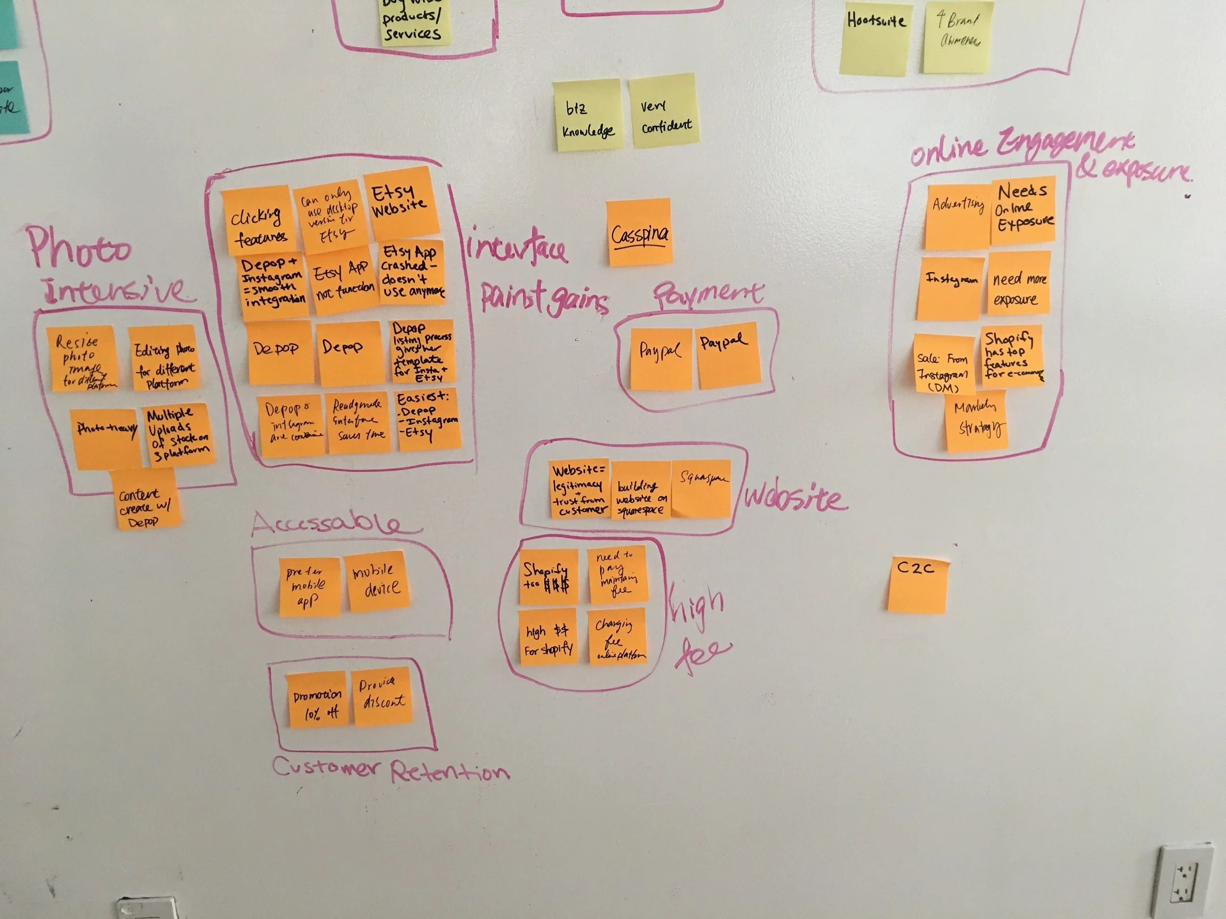
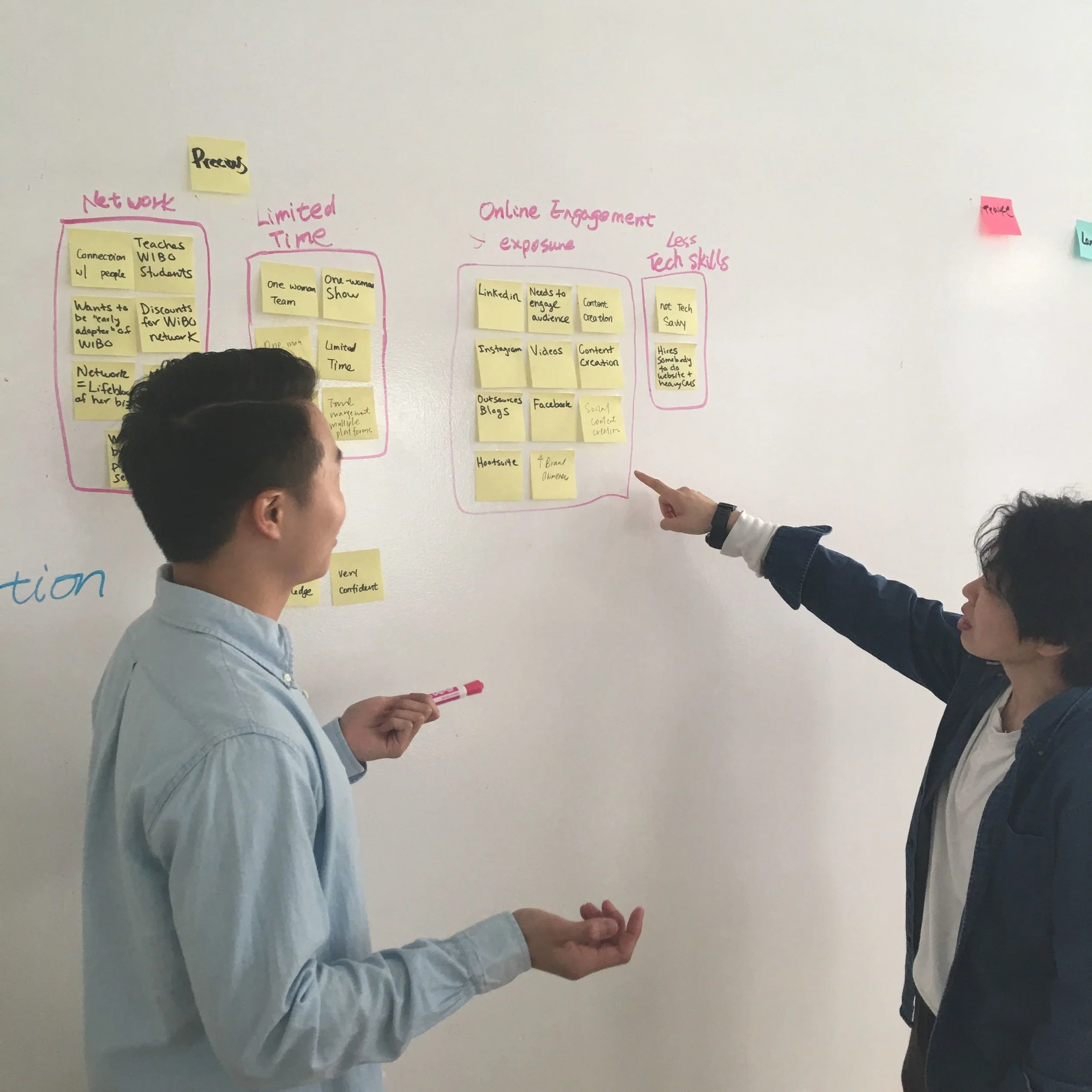
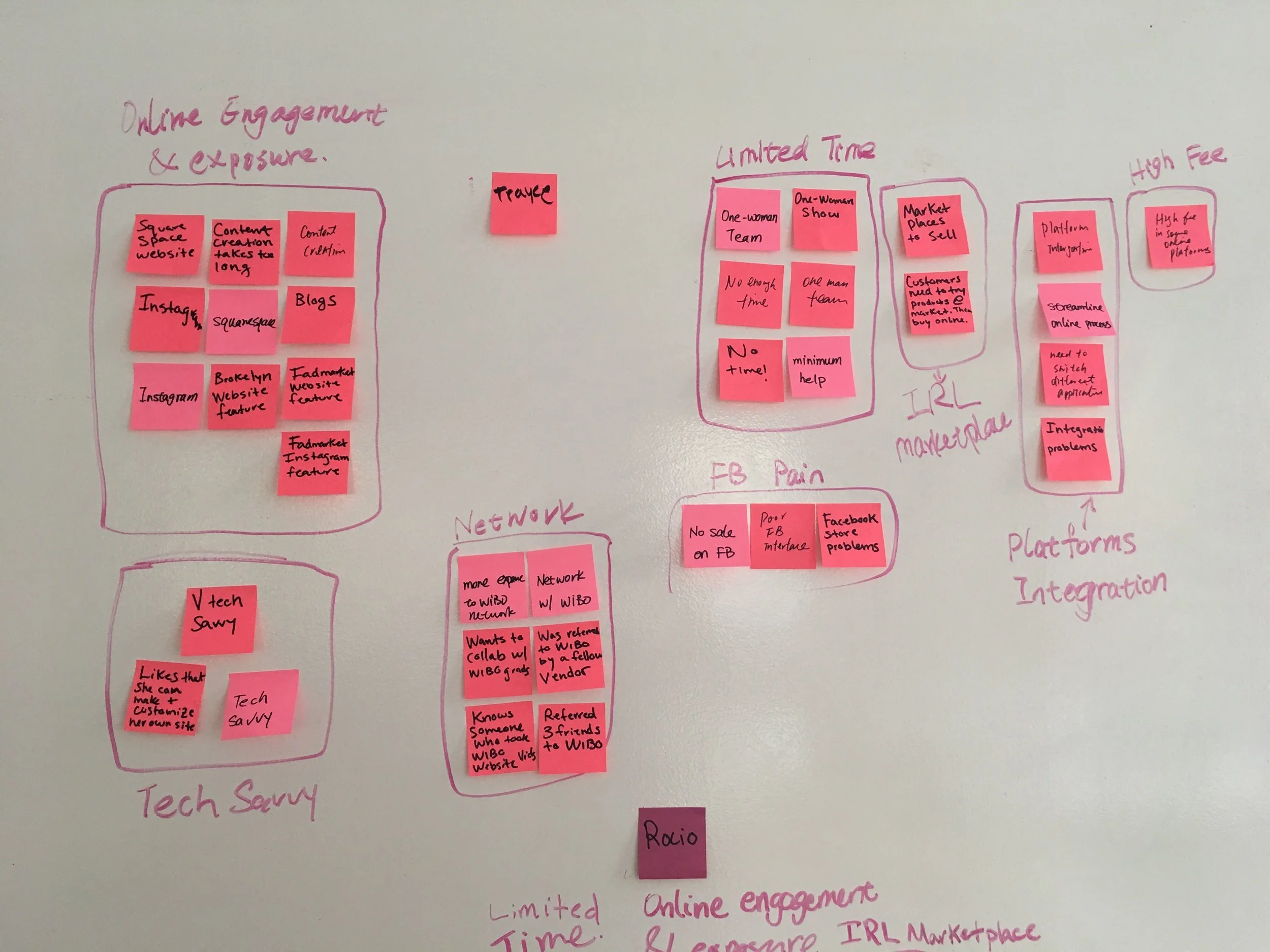
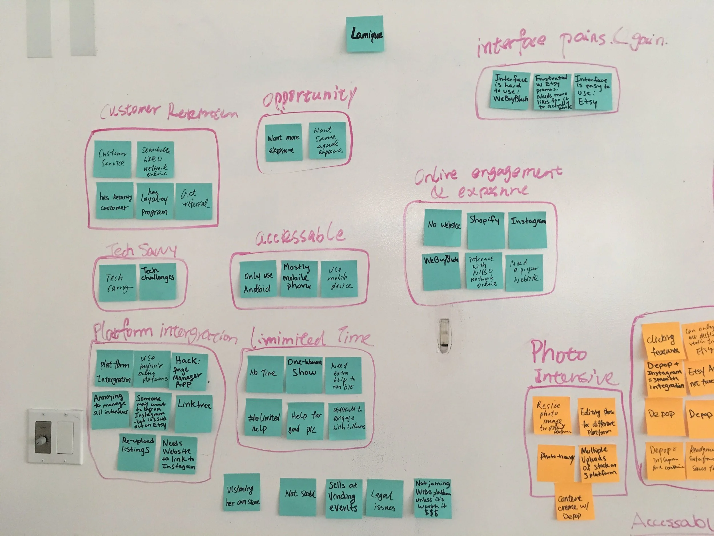
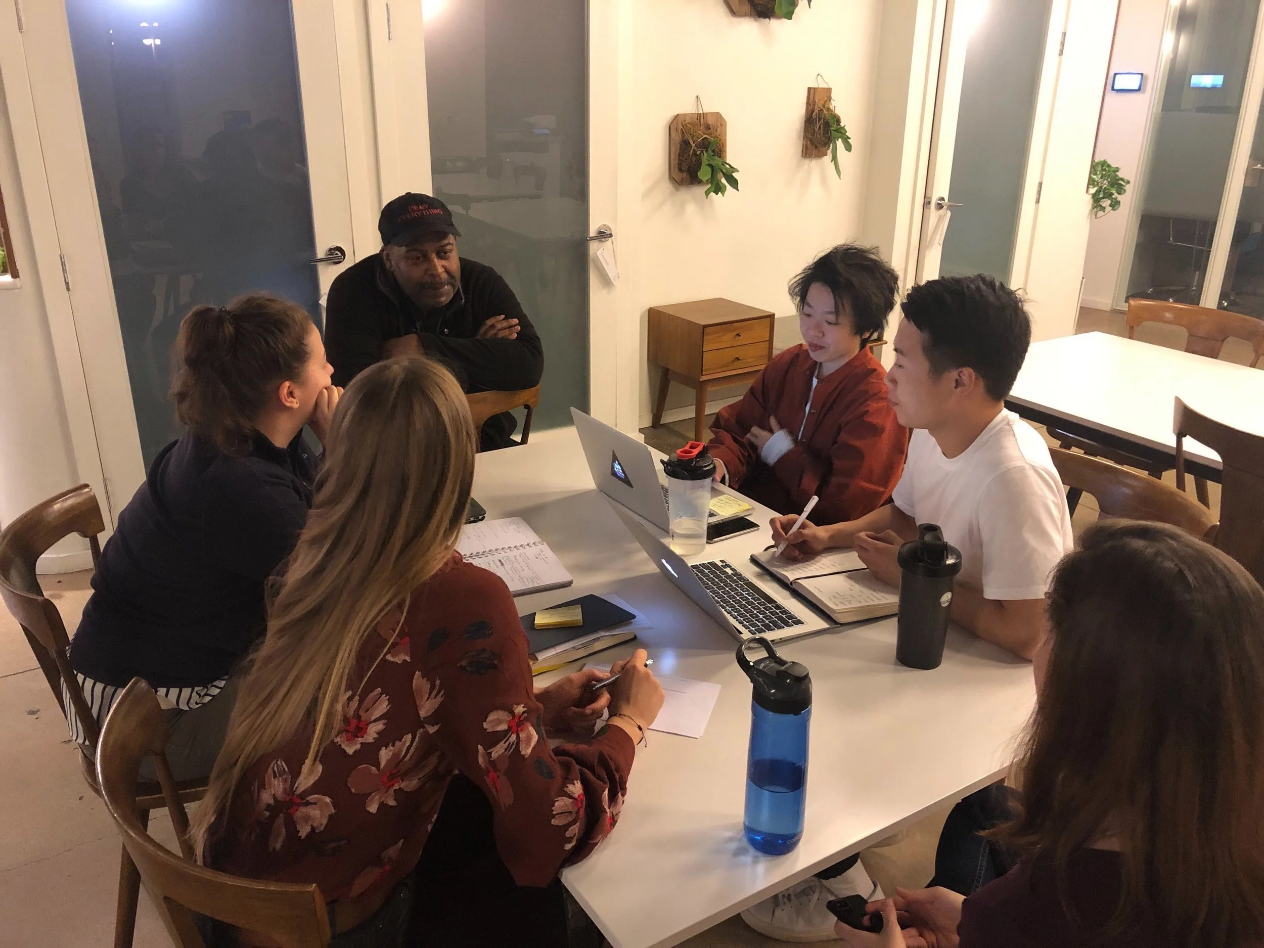
To better understand the context in which WIBO alumni run their business, we began our explorative research by conducting 8 hour-long interviews through video calls and in-person. We developed overarching research questions to drive our semi-structured interviews: how can an e-commerce platform influence every day life of WIBO graduates; what opportunities and constraints exist in this space; and which have been under- or over-explored? After evaluating the interviews and organizing gathered data we highlighted following insights:
Business owners selling not only products but also services
Level of tech-savvies varies significantly
Our users are all alone on their e-commerce journey
Majority of business owners consider cellphone as a primary device for running a business online
Many users mentioned the importance of social media integration
Competitive Analysis
Then I conducted competitive analysis to broaden our understanding of the field. I compared registration, on-boarding processes, and key features of 10 e-commerce direct and indirect competitors. The goal was to define the most popular and useful features across different platforms and outline those that would work for the WIBO project. Some of the questions I was trying to answer: What is the working mechanism of these platforms? What are the “star” features of these apps? What is the visual structure and user interface of these platforms?
Results
Only 1 platform out of 10 is offering services for sale
8 platforms offer pre-designed layout to save time and effort for busy entrepreneurs
9 platforms offer an internal inventory management tool
Only 4 platforms have social media integrations available
User Personas
Next step was creating user personas that would reflect our findings from interviews. After organizing and analyzing responses we’ve highlighted the most noticeable trends and created personas of 2 target users – a tech-savvy business owner selling products and having expanded inventory list, a newly graduated from WIBO entrepreneur offering services and having very limited experience with e-commerce.


User Journey
My team and I created a user journey to identify pain points that we could investigate more deeply in usability tests.
Feature Assessment
Based on the gathered data from user interviews, competitive analysis, and after a brainstorm session with the client, we created a list of features that will make Shop WIBO platform attractive for business owners:
Ideation
“How might we design an e-commerce platform for WIBO alumni that all our users will have seamless experience despite different levels of tech savviness and size of business?”
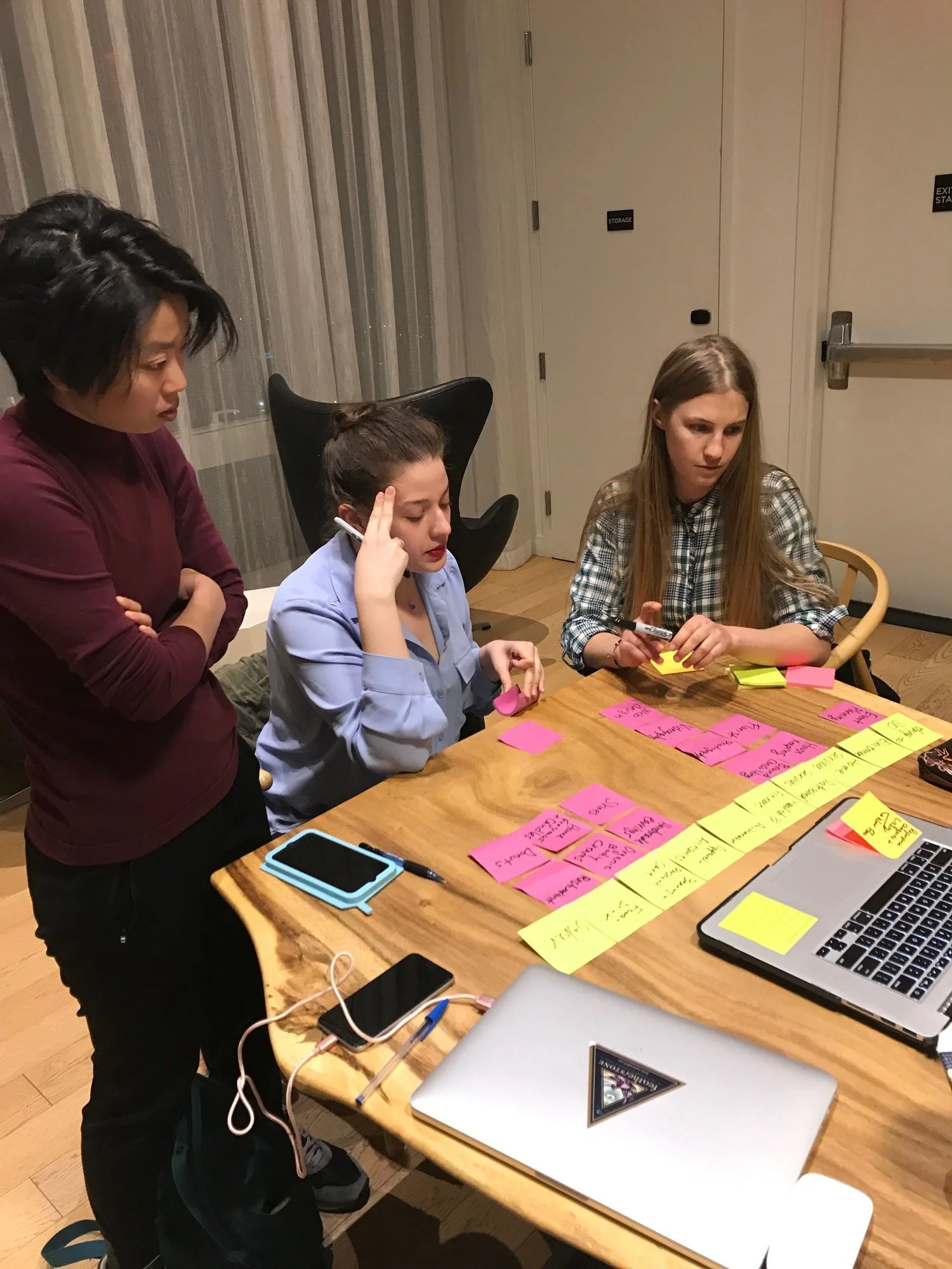
We developed an affinity wall to analyze our findings, narrow down ideas, and define the direction of our future design.

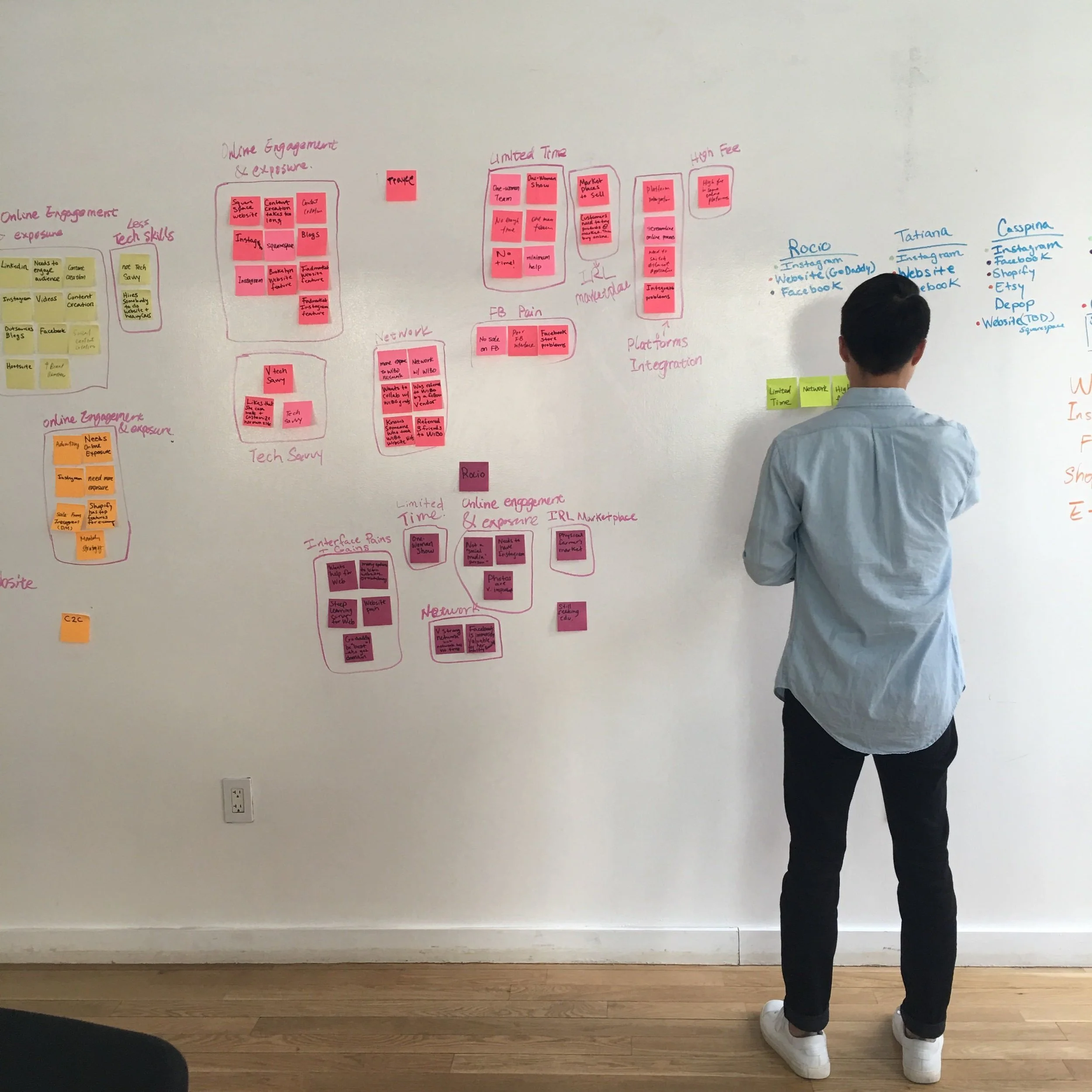
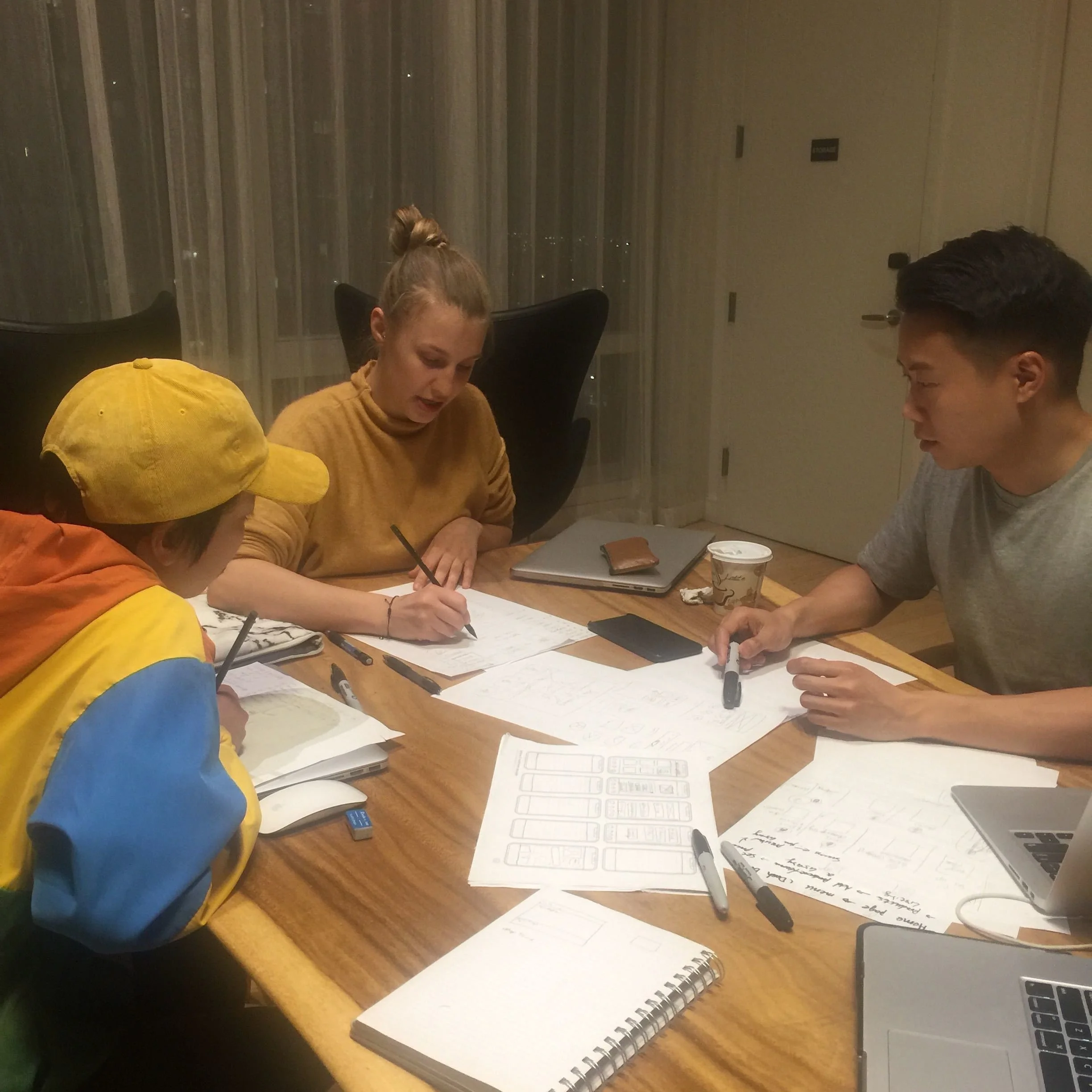
My team and I were using personas and the list of features to help us translate our findings from interviews towards creating an efficient solution for our users. We divided the design process by steps: the on-boarding process, setting up an account, and listing a product. Focusing on creating logical experience we mapped user flows to demonstrate the potential paths of a user performing these tasks.


Next I created a site map to better understand how the platform’s front-end interfaced with the back-end, to ensure content is in places users would expect to find it. We used this document later as a reference point for wireframes.
How the navigation should be structured
Relationship between different pages
Provide a structure upon which to begin estimates for development
Testing and Iteration
Testing
We conducted user testing to challenge our assumptions we made during the ideation process by bringing our concept to target users. We used Sketch and InVision to create low fidelity prototypes of two essential processes - on-boarding and listing a product. Mobile was chosen because our research indicated that our users were using mobile to maintain and monitor the majority of their online business channels.
All participants had different business backgrounds and tech proficiency, which allowed us to collect extremely useful feedback on the prototype.
While users were trying to perform several tasks, my team was noting moments when users struggled to find the right button to click, were confused within a flow, requested something that wasn’t currently mocked up on the prototype, and/ or liked something on the site.
The gathered data was divided into three groups: User Interface, Content, and Features. This segmentation helped us to focus on the most important aspects of each area for improvement.
While analyzing users’ comments, we noticed some trends. Many users had issues with the same area of the prototype or complimented the same feature.
For example, we received several complaints about button colors which didn't indicate when a button was available to click.
The majority of users liked the presence of guides to facilitate their storefront setup.
They were all pleased to see social media integrations.
Five out of six users struggled with the categories section.
Design Revisions
As a result of the initial round of testing, we had enough evidence to support a revision of the following elements:
Page structure
Visual design uniformity
Text guides and CTAs
The Categories — users struggled to choose between service and product
The Listing Fields — we needed a better way to add the necessary fields for listing without feature overload.

New step was comparative research of how other e-commerce sites tackle these problems and developing a strategy for improving our current prototype.
After taking in consideration gathered feedback and applying the best practices from other e-commerce platforms we updated the original prototype and increased fidelity for the final round of testing.
At this stage of testing we received very positive reaction from business owners as well as their active interest to the platform. Users have performed given tasks without any troubles or additional questions.
Final Design


Further Opportunities
Shop WIBO proved to be a desired and very flexible tool for achieving goals of both, WIBO management and graduates. My team and I identified areas for continued work and future growth.
Use Shop WIBO in the WIBO curriculum to teach about e-commerce & best practices.
Create video tutorials that will be included to the 16 weeks workshop materials. The educational course will guide user how to work with the platform, connect integrations, sell products, and walk user through each feature step by step. For example, a popup would tell the user about all features in the main menu; then, there might be a popup pointing their attention to the listing creation process and increasing their statistics. Additionally, the onboarding/tutorial process could help ensure that users are aware of all possible opportunities on the platform.
Collect data for categories by using the tag system.
Our solution for categories is a beginning for a potential research project. By collecting data about the most often used tags WIBO team can update or create a new list of categories that will specifically reflect Shop WIBO audience.
Use Shop WIBO as an additional channel to promote WIBO Academy .
Moving forward, the ideal solution would be to use the home page as direct channel for communication with Shop WIBO users. Flexible layout and easy scrolling feature allows WIBO post news and updates that will definitely be noticed. Additional sources fromWIBO Academy can be advertised on the dashboard.